Medication noncompliance is a prevalent issue among individuals, resulting in poor health outcomes and increased healthcare costs. To address these issues, we propose Refill, a mobile app that streamlines medication management with user-friendly no-code automation, providing personalized health recommendations, automatic prescription refills, and seamless communication with healthcare providers via biometric data from Apple Watch.
Medication noncompliance is a prevalent issue among individuals, resulting in poor health outcomes and increased healthcare costs. To address these issues, we propose Refill, a mobile app that streamlines medication management with user-friendly no-code automation, providing personalized health recommendations, automatic prescription refills, and seamless communication with healthcare providers via biometric data from Apple Watch.
Medication noncompliance is a prevalent issue among individuals, resulting in poor health outcomes and increased healthcare costs. To address these issues, we propose Refill, a mobile app that streamlines medication management with user-friendly no-code automation, providing personalized health recommendations, automatic prescription refills, and seamless communication with healthcare providers via biometric data from Apple Watch.
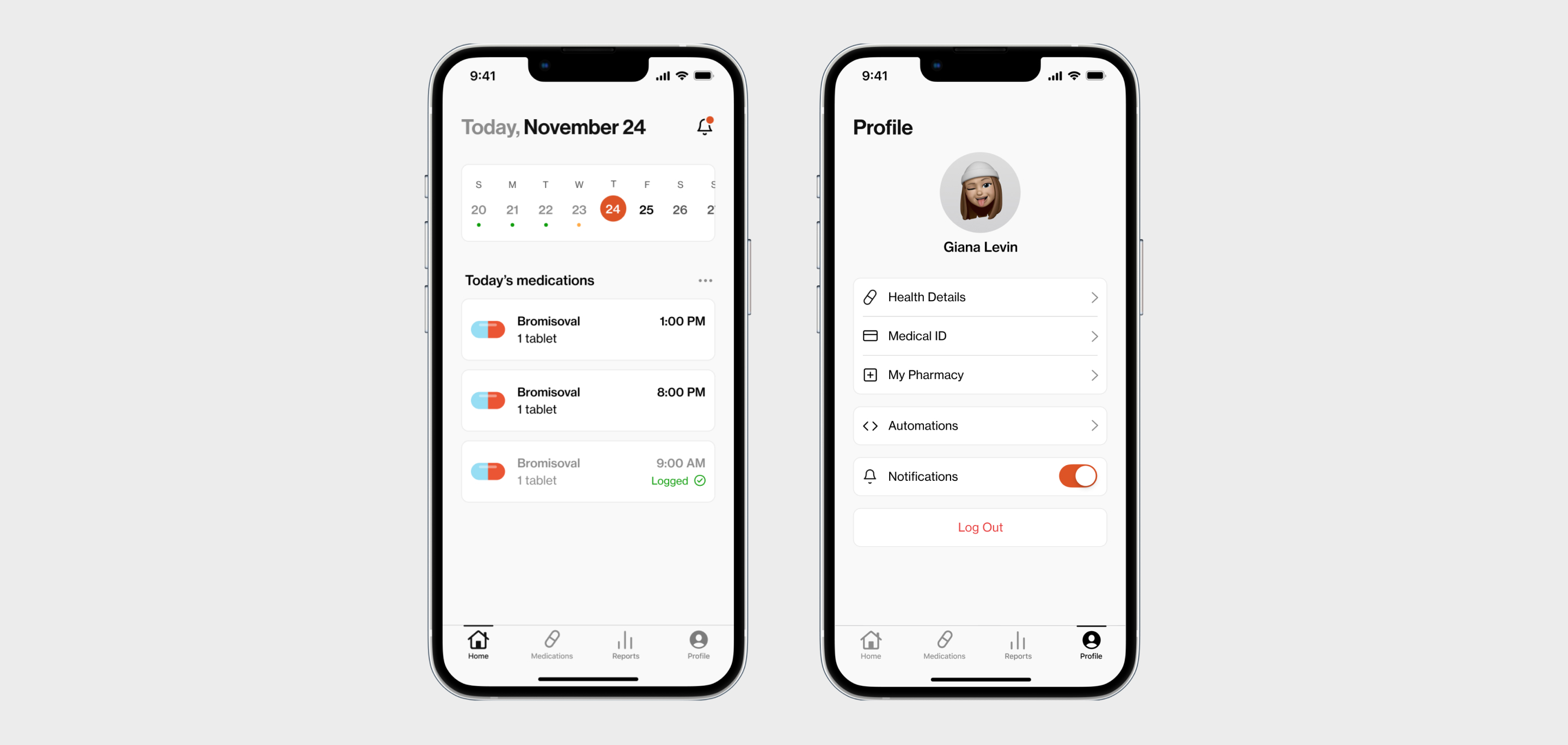
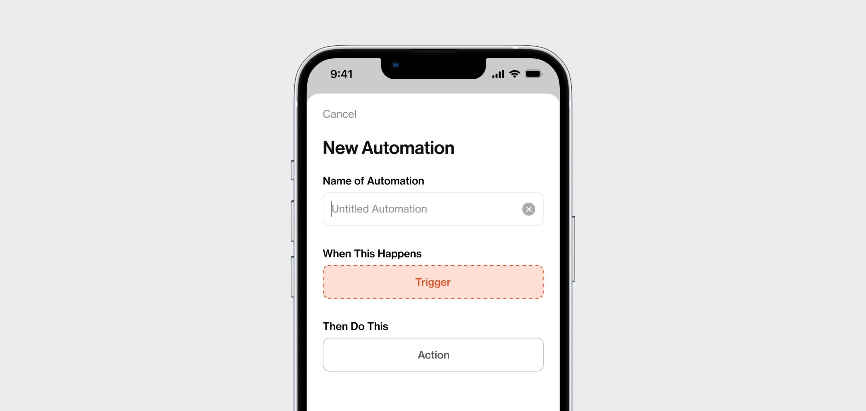
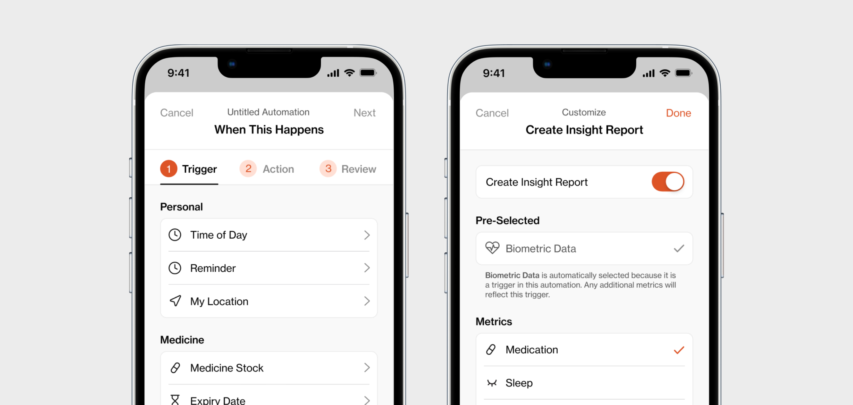
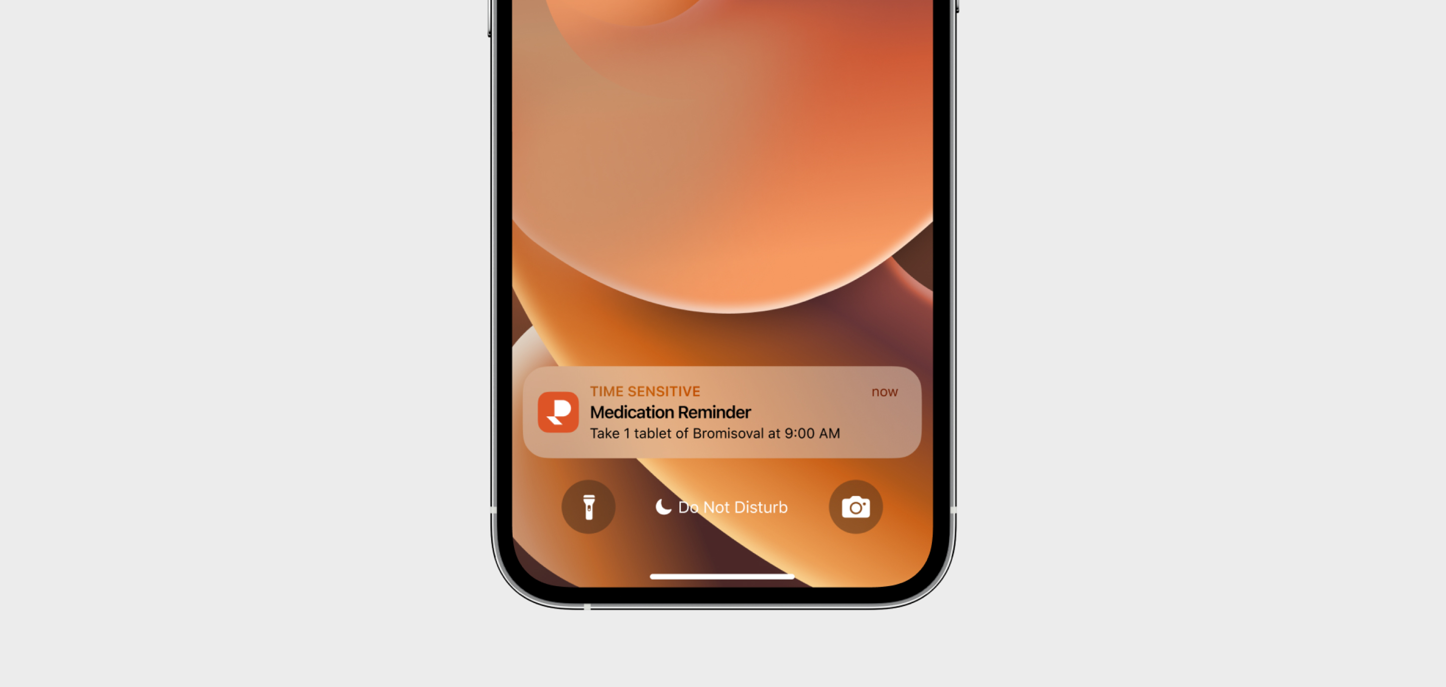


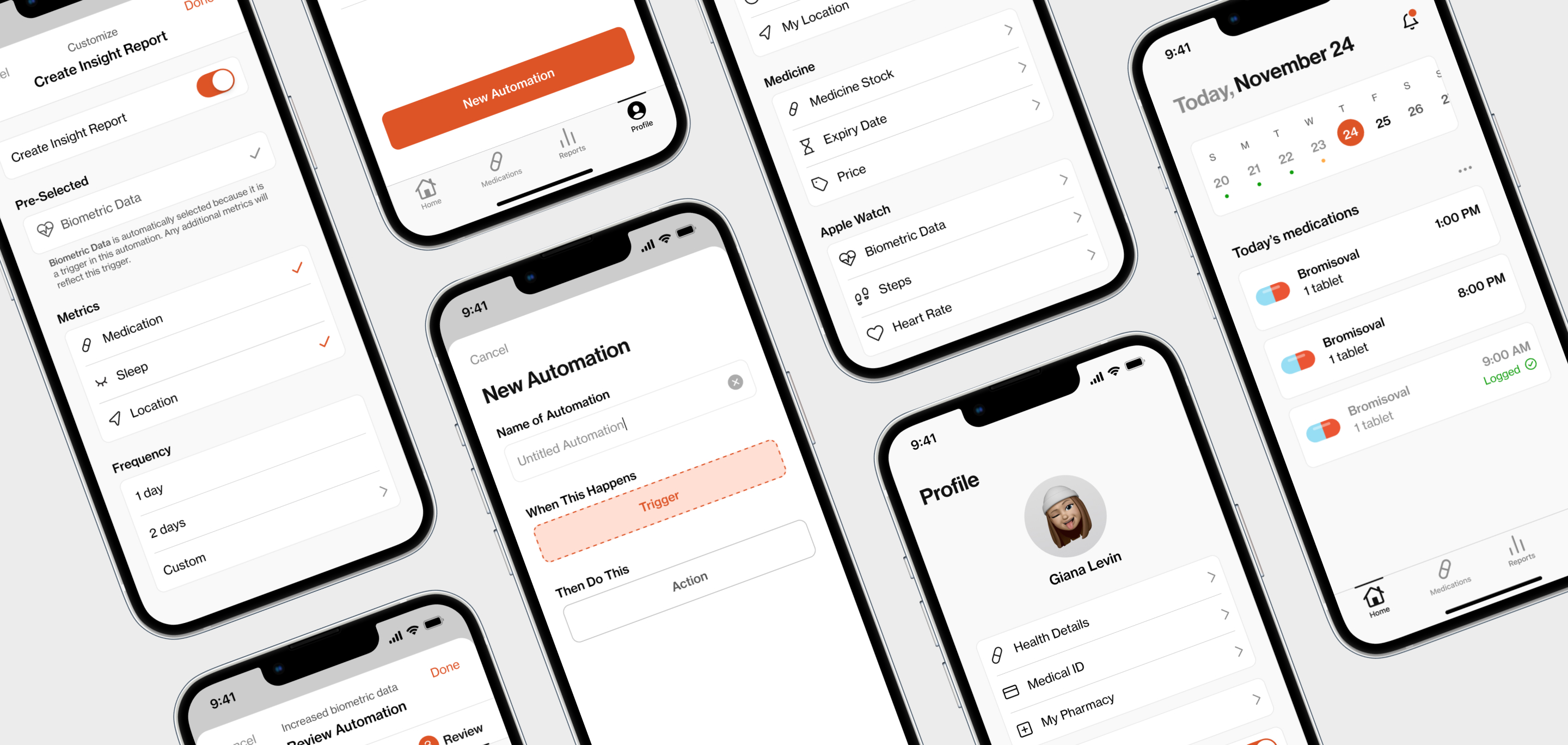
Creating an automation has never been easier. Users are provided with clear instructions on the creation process by using the phrase "when this happens, then do this." The UI and language are kept simple to make the technical process and nature of automations more user-friendly and accessible. During the creation process, the navigation remains fixed to ensure users are always aware of their current stage and can make changes easily. All list items under the ‘trigger’ and ‘action’ steps are accompanied by visual icons to improve comprehension and accessibility. The final step allows the user to review their automation in simple language before creating.
Creating an automation has never been easier. Users are provided with clear instructions on the creation process by using the phrase "when this happens, then do this." The UI and language are kept simple to make the technical process and nature of automations more user-friendly and accessible. During the creation process, the navigation remains fixed to ensure users are always aware of their current stage and can make changes easily. All list items under the ‘trigger’ and ‘action’ steps are accompanied by visual icons to improve comprehension and accessibility. The final step allows the user to review their automation in simple language before creating.
Creating an automation has never been easier. Users are provided with clear instructions on the creation process by using the phrase "when this happens, then do this." The UI and language are kept simple to make the technical process and nature of automations more user-friendly and accessible. During the creation process, the navigation remains fixed to ensure users are always aware of their current stage and can make changes easily. All list items under the ‘trigger’ and ‘action’ steps are accompanied by visual icons to improve comprehension and accessibility. The final step allows the user to review their automation in simple language before creating.

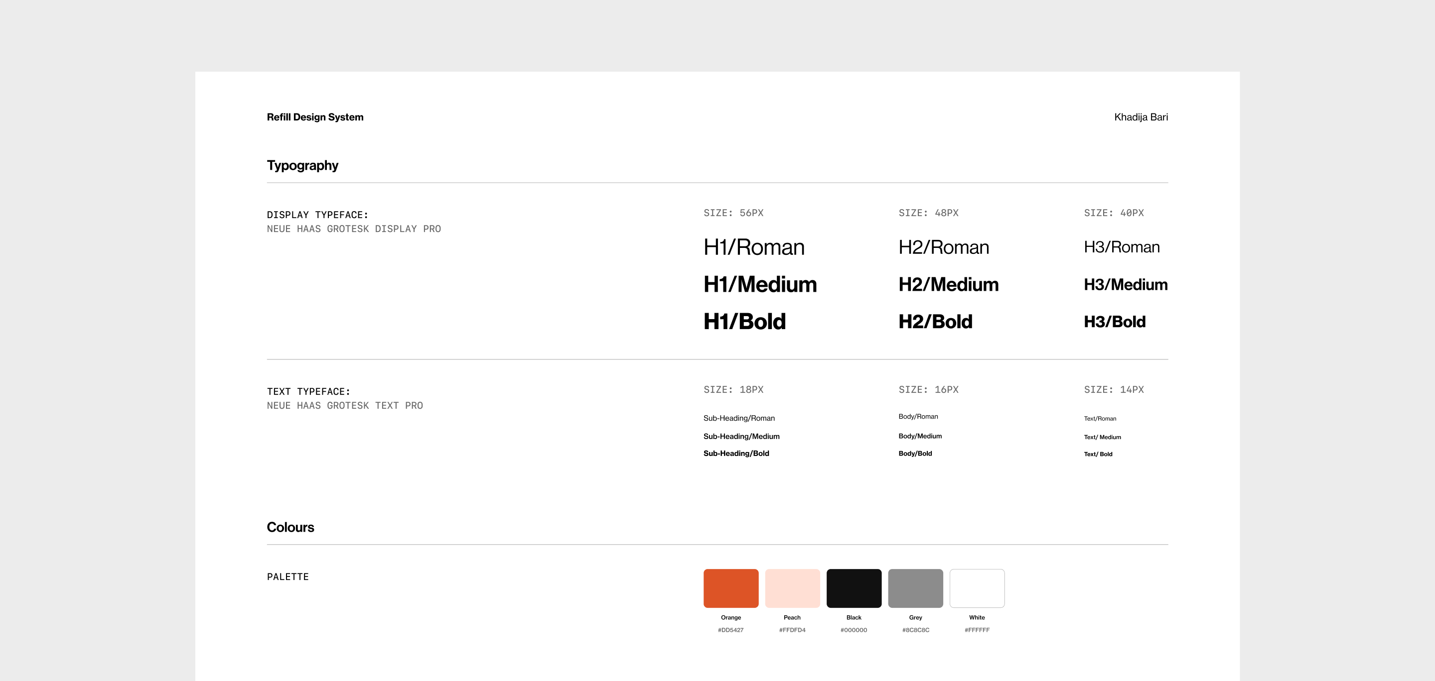


The app carries an intuitive and friendly UI to make custom automations more accessible to the average user. Various best practices are employed for visual accessibility and written content to ensure that users can manage their health effectively without being distracted by unnecessary jargon. The brand identity is designed to be simple, modern, versatile, and memorable. The colour palette features a greyscale with an orange accent colour to resemble prescription medication bottles. This adds some personality while still maintaining the seriousness associated with healthcare. The typeface is chosen for its clean, modern look and its ability to scale well across different text sizes to ensure consistency and seriousness throughout the app.
The app carries an intuitive and friendly UI to make custom automations more accessible to the average user. Various best practices are employed for visual accessibility and written content to ensure that users can manage their health effectively without being distracted by unnecessary jargon. The brand identity is designed to be simple, modern, versatile, and memorable. The colour palette features a greyscale with an orange accent colour to resemble prescription medication bottles. This adds some personality while still maintaining the seriousness associated with healthcare. The typeface is chosen for its clean, modern look and its ability to scale well across different text sizes to ensure consistency and seriousness throughout the app.
The app carries an intuitive and friendly UI to make custom automations more accessible to the average user. Various best practices are employed for visual accessibility and written content to ensure that users can manage their health effectively without being distracted by unnecessary jargon. The brand identity is designed to be simple, modern, versatile, and memorable. The colour palette features a greyscale with an orange accent colour to resemble prescription medication bottles. This adds some personality while still maintaining the seriousness associated with healthcare. The typeface is chosen for its clean, modern look and its ability to scale well across different text sizes to ensure consistency and seriousness throughout the app.