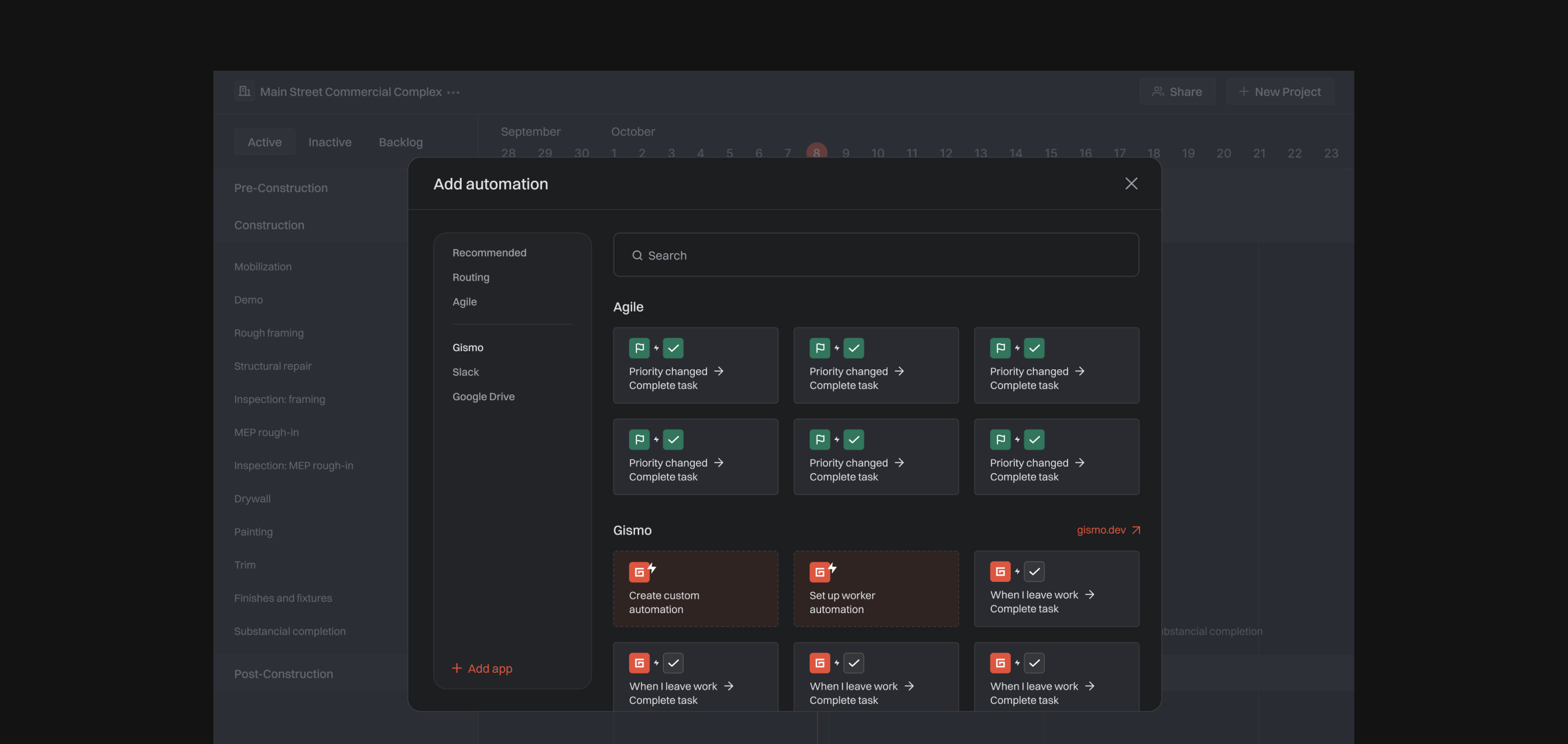
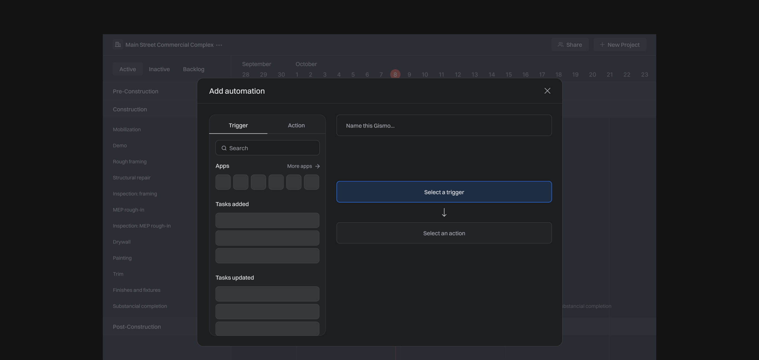
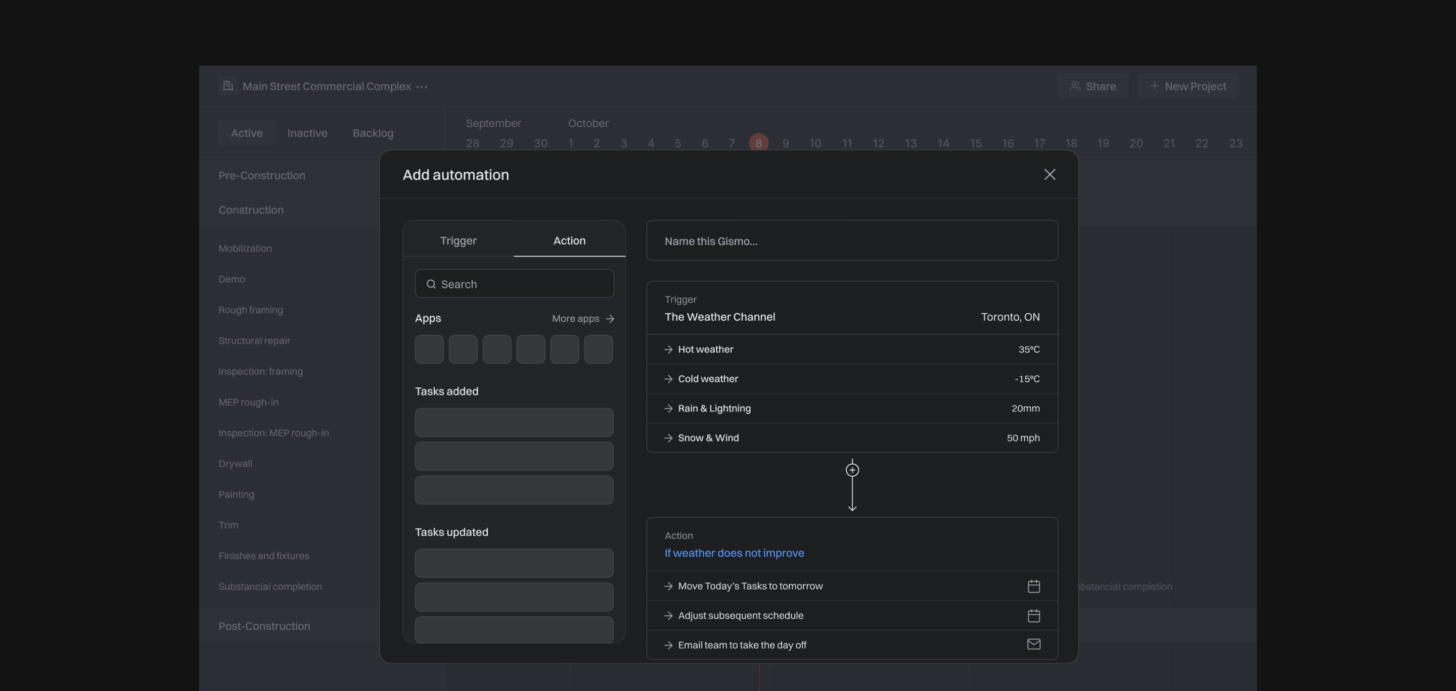
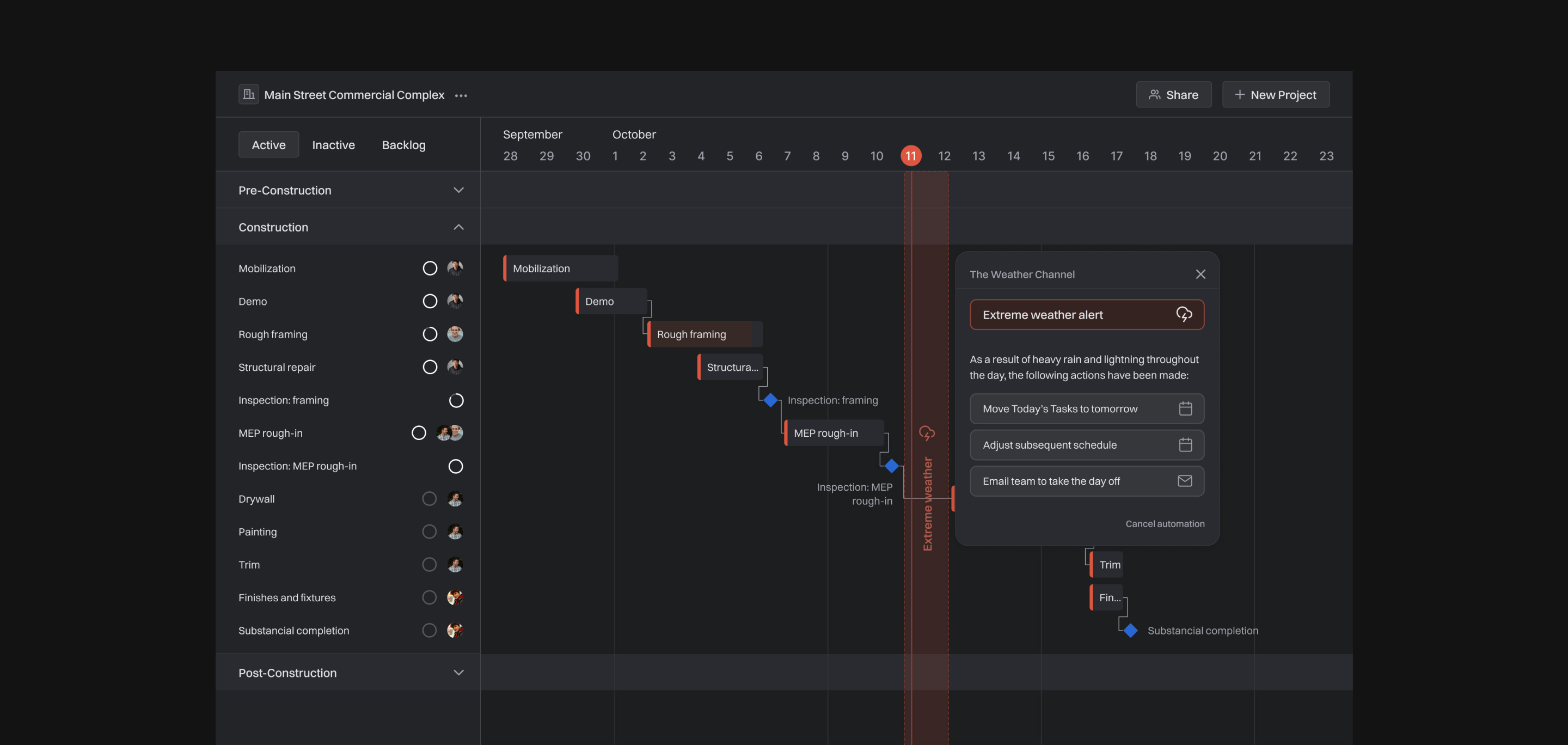


Gismo is a no-code automation tool that integrates right into your project management software to help streamline communication between your workflow. This reduces the noise of repetitive software and instead, maximizes on their efficiency. Gismo provides a set of pre-built automations, as well as an option to create custom automations through Gismo’s open library of apps. When triggers and actions are inputted, the software translates them into natural language. This makes automation seem a lot less scary and more efficient.
Gismo is a no-code automation tool that integrates right into your project management software to help streamline communication between your workflow. This reduces the noise of repetitive software and instead, maximizes on their efficiency. Gismo provides a set of pre-built automations, as well as an option to create custom automations through Gismo’s open library of apps. When triggers and actions are inputted, the software translates them into natural language. This makes automation seem a lot less scary and more efficient.
Gismo is a no-code automation tool that integrates right into your project management software to help streamline communication between your workflow. This reduces the noise of repetitive software and instead, maximizes on their efficiency. Gismo provides a set of pre-built automations, as well as an option to create custom automations through Gismo’s open library of apps. When triggers and actions are inputted, the software translates them into natural language. This makes automation seem a lot less scary and more efficient.
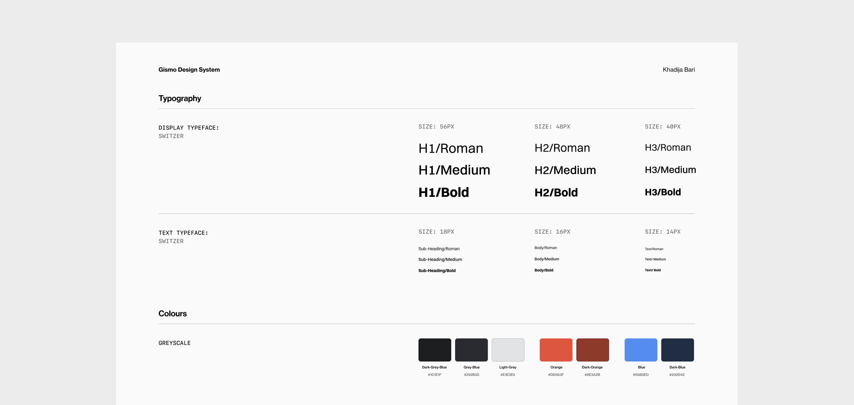


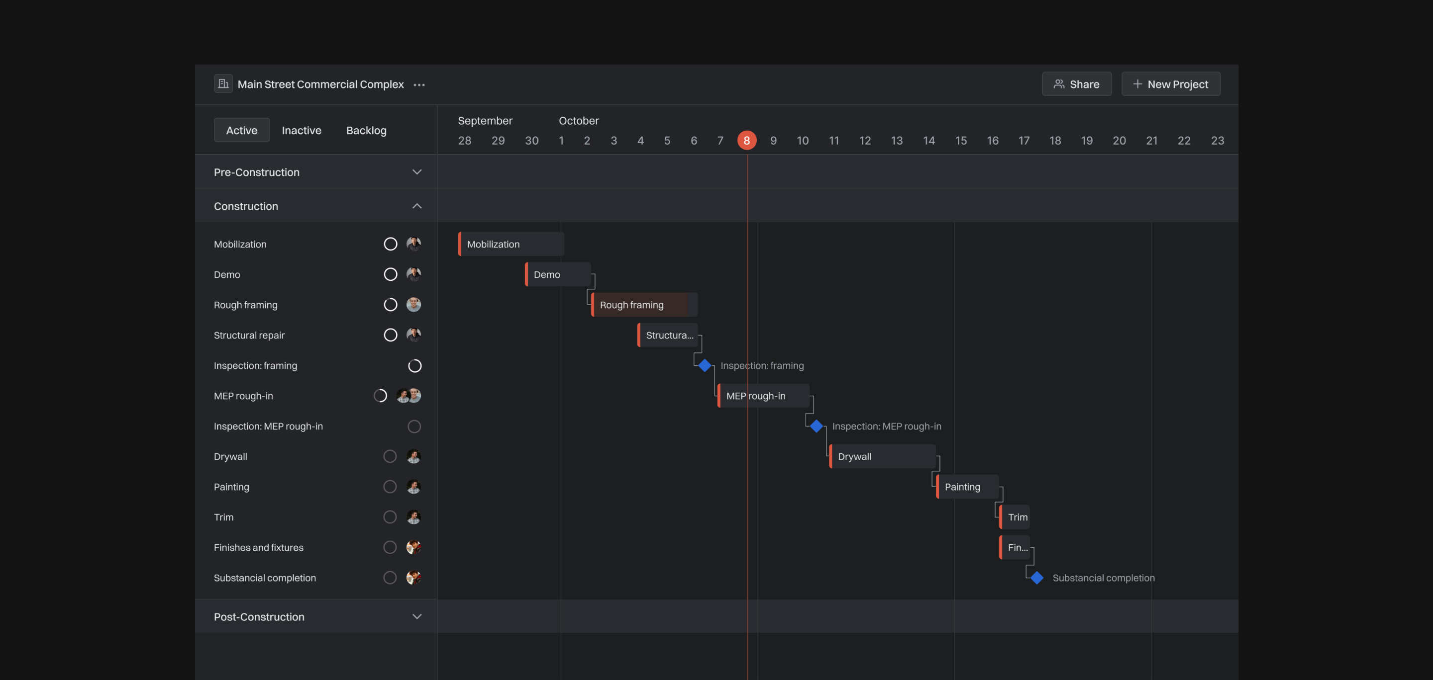
I chose to design this interface in dark mode for deeper immersion, higher productivity, and reduced eye strain when active for long periods of time. The bright orange stands out as an accent colour amidst the minimal interface of the software to emphasize things of importance. The colours for the automation are kept different to make it clear that the user is in a different state of interaction, and because the accent orange might appear alarming or connote the incorrect message.
I chose to design this interface in dark mode for deeper immersion, higher productivity, and reduced eye strain when active for long periods of time. The bright orange stands out as an accent colour amidst the minimal interface of the software to emphasize things of importance. The colours for the automation are kept different to make it clear that the user is in a different state of interaction, and because the accent orange might appear alarming or connote the incorrect message.
I chose to design this interface in dark mode for deeper immersion, higher productivity, and reduced eye strain when active for long periods of time. The bright orange stands out as an accent colour amidst the minimal interface of the software to emphasize things of importance. The colours for the automation are kept different to make it clear that the user is in a different state of interaction, and because the accent orange might appear alarming or connote the incorrect message.