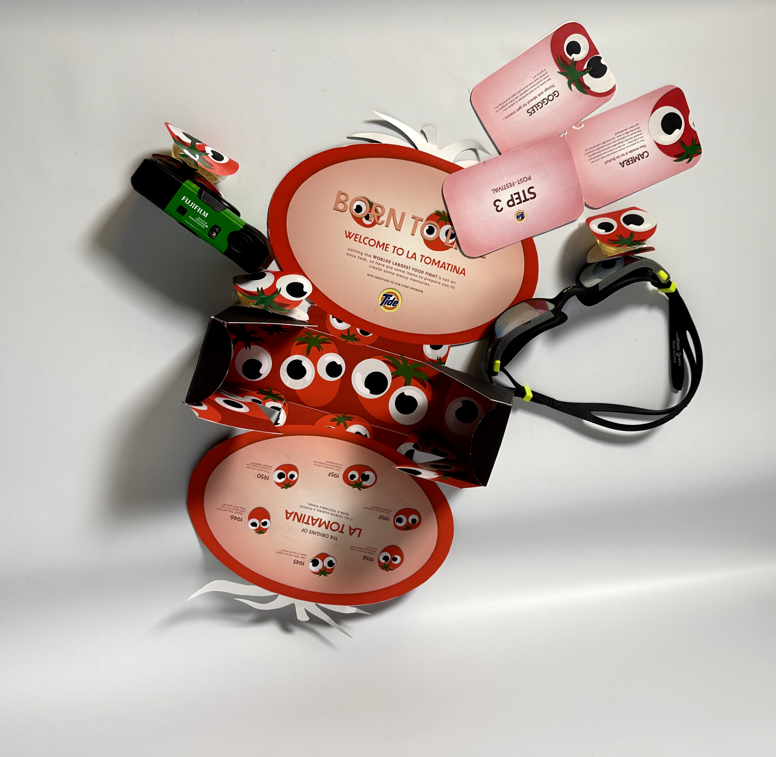


The La Tomatina Package design was created to express the joy and wondrous adventure of Travelling to Buñol Spain to participate in the world's largest food fight. Tourists from over 30 different countries fill the streets of the city to participate in a very messy yet somewhat liberating experience. From the population of 9000 increasing upward of 50,000 guests, the package design for this event was created to entice and elicit the emotions of excitement through the bold typography, and lightheartedness and joy through the cute illustrations.
The La Tomatina Package design was created to express the joy and wondrous adventure of Travelling to Buñol Spain to participate in the world's largest food fight. Tourists from over 30 different countries fill the streets of the city to participate in a very messy yet somewhat liberating experience. From the population of 9000 increasing upward of 50,000 guests, the package design for this event was created to entice and elicit the emotions of excitement through the bold typography, and lightheartedness and joy through the cute illustrations.
The La Tomatina Package design was created to express the joy and wondrous adventure of Travelling to Buñol Spain to participate in the world's largest food fight. Tourists from over 30 different countries fill the streets of the city to participate in a very messy yet somewhat liberating experience. From the population of 9000 increasing upward of 50,000 guests, the package design for this event was created to entice and elicit the emotions of excitement through the bold typography, and lightheartedness and joy through the cute illustrations.
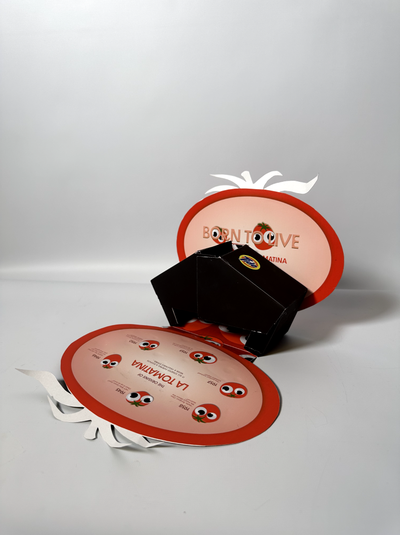


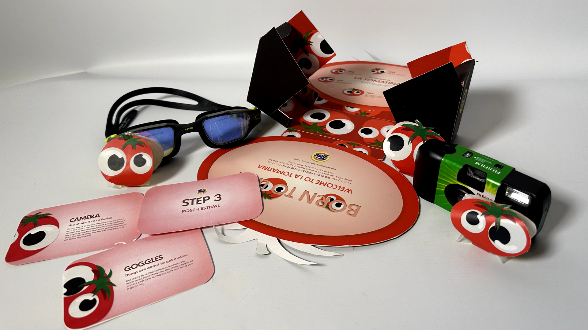
The festival goer is asked to embark on this messy journey while keeping in mind three steps: 1) capture as many memories with the disposable camera. 2) Keep your eyes protected during the fight. 3) Get your original clothes back with the Tide Pods partnership. The package design includes bold lettering of the event's name. The colours chosen were overly saturated to emphasize the tomato-ness. The lettering was also carefully texturized to have a sheen to it as the material chosen was card-stock. The colours chosen within the packaging are reminiscent of the pink stains that may be left on individuals’ clothing after the fight. The dark greens and reds were chosen to contract with the pink, but along with the Tide logo as well. Within the box, the original logo of the La Tomatina festival was interpolated within his package design by using large googly eyes.
The festival goer is asked to embark on this messy journey while keeping in mind three steps: 1) capture as many memories with the disposable camera. 2) Keep your eyes protected during the fight. 3) Get your original clothes back with the Tide Pods partnership. The package design includes bold lettering of the event's name. The colours chosen were overly saturated to emphasize the tomato-ness. The lettering was also carefully texturized to have a sheen to it as the material chosen was card-stock. The colours chosen within the packaging are reminiscent of the pink stains that may be left on individuals’ clothing after the fight. The dark greens and reds were chosen to contract with the pink, but along with the Tide logo as well. Within the box, the original logo of the La Tomatina festival was interpolated within his package design by using large googly eyes.
The festival goer is asked to embark on this messy journey while keeping in mind three steps: 1) capture as many memories with the disposable camera. 2) Keep your eyes protected during the fight. 3) Get your original clothes back with the Tide Pods partnership. The package design includes bold lettering of the event's name. The colours chosen were overly saturated to emphasize the tomato-ness. The lettering was also carefully texturized to have a sheen to it as the material chosen was card-stock. The colours chosen within the packaging are reminiscent of the pink stains that may be left on individuals’ clothing after the fight. The dark greens and reds were chosen to contract with the pink, but along with the Tide logo as well. Within the box, the original logo of the La Tomatina festival was interpolated within his package design by using large googly eyes.
