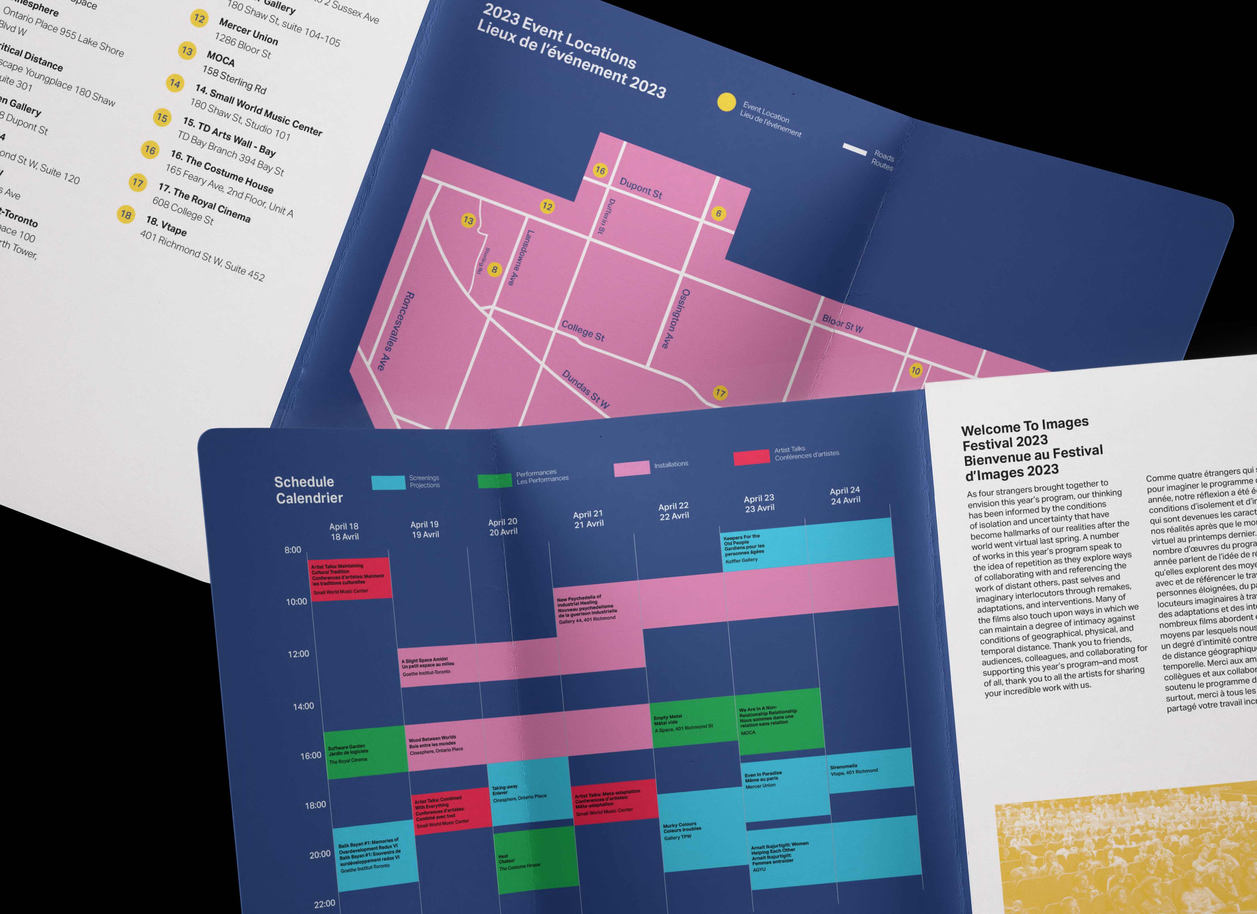
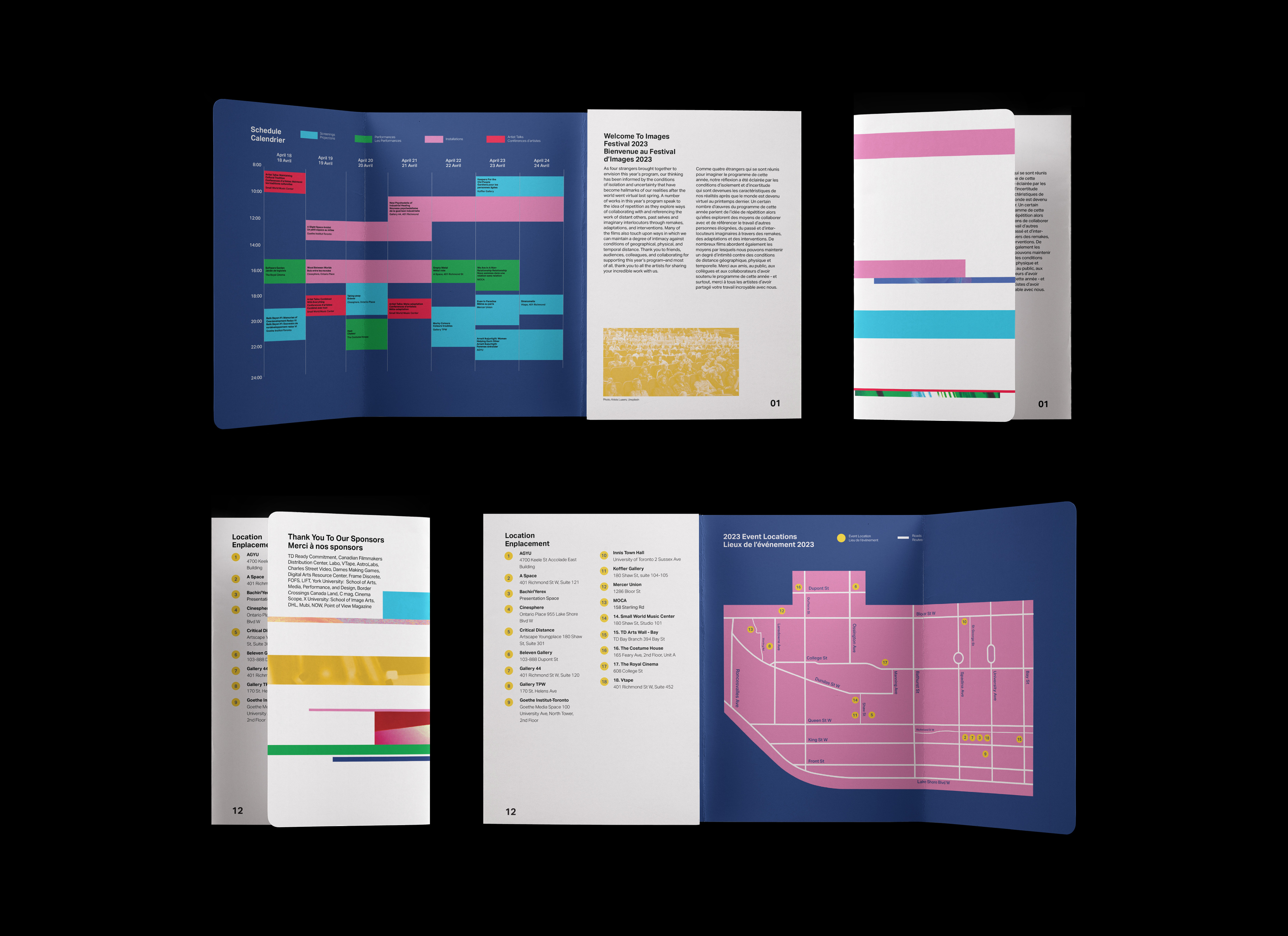


The Images Festival is held annually in Toronto and displays exhibitions of independent film and media art. This fictional rebranding project introduces a flexible branding system that communicates the experimental nature of the festival to a young adult audience.
The Images Festival is held annually in Toronto and displays exhibitions of independent film and media art. This fictional rebranding project introduces a flexible branding system that communicates the experimental nature of the festival to a young adult audience.
The Images Festival is held annually in Toronto and displays exhibitions of independent film and media art. This fictional rebranding project introduces a flexible branding system that communicates the experimental nature of the festival to a young adult audience.
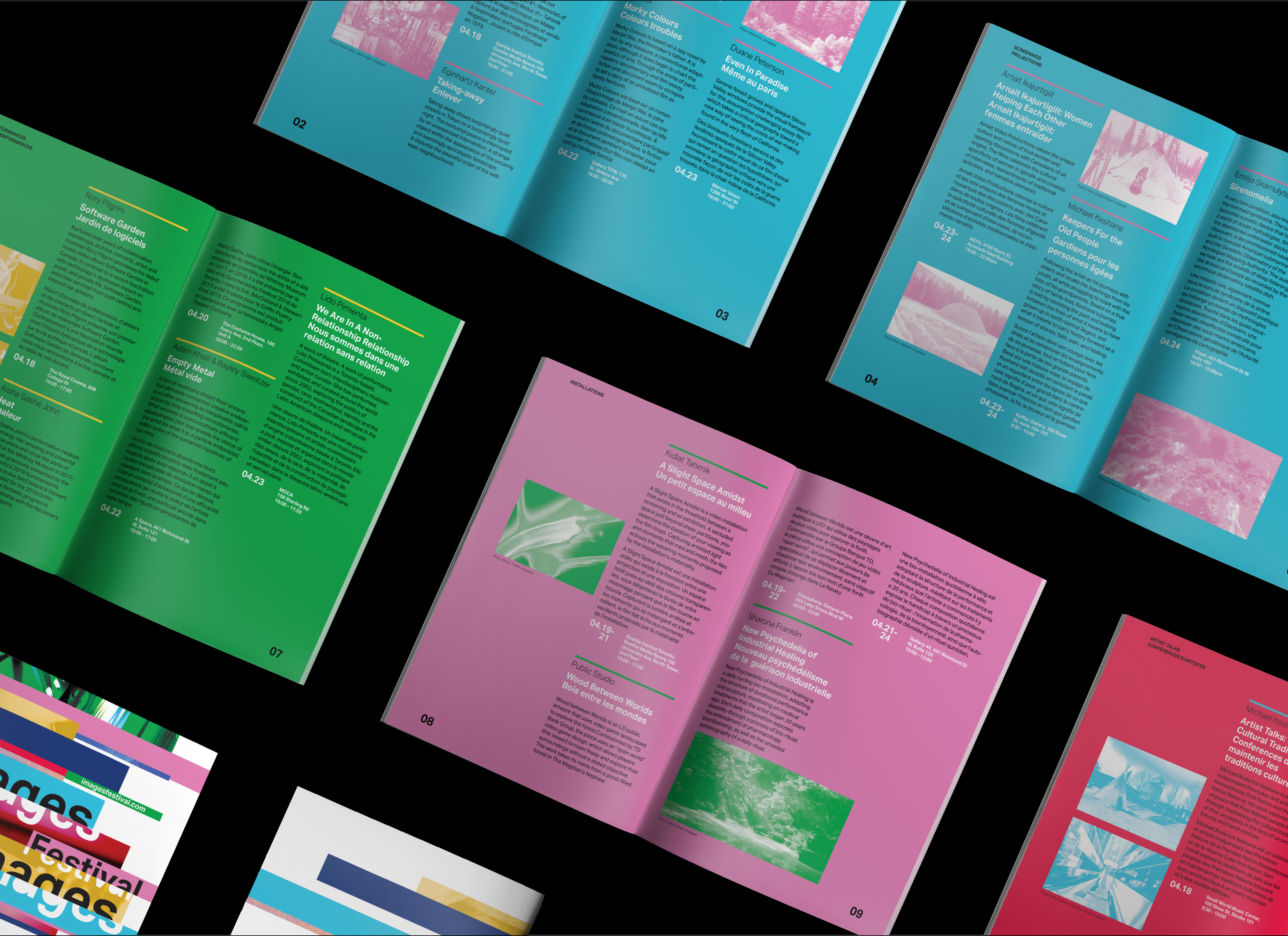


Drawing inspiration from the festival's film, video, and media art roots, the festival's brochure and poster are redesigned using bright colours, an edge-to-edge layering layout, and image manipulation.
Drawing inspiration from the festival's film, video, and media art roots, the festival's brochure and poster are redesigned using bright colours, an edge-to-edge layering layout, and image manipulation.
Drawing inspiration from the festival's film, video, and media art roots, the festival's brochure and poster are redesigned using bright colours, an edge-to-edge layering layout, and image manipulation.
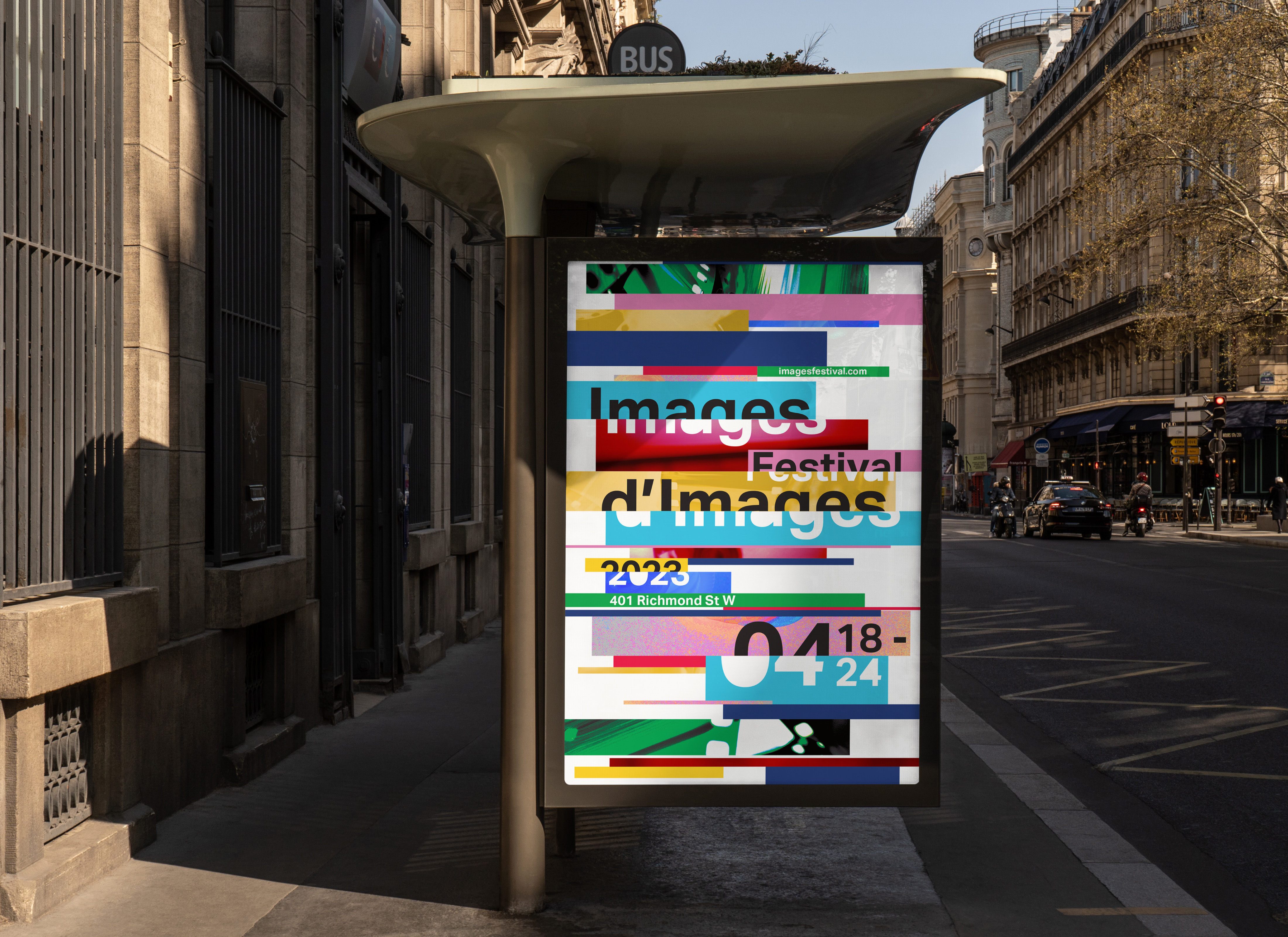


Inspired by the 'Please Stand By' colour bars of retro television, the horizontal bars symbolize moving image content and their glitch-like positioning expresses the edgy and experimental aspects of multimedia content. The colour palette is consistently present throughout all modes of communication for cohesion - the 8" x 5.5" festival program and 20" x 30" festival poster.
Inspired by the 'Please Stand By' colour bars of retro television, the horizontal bars symbolize moving image content and their glitch-like positioning expresses the edgy and experimental aspects of multimedia content. The colour palette is consistently present throughout all modes of communication for cohesion - the 8" x 5.5" festival program and 20" x 30" festival poster.
Inspired by the 'Please Stand By' colour bars of retro television, the horizontal bars symbolize moving image content and their glitch-like positioning expresses the edgy and experimental aspects of multimedia content. The colour palette is consistently present throughout all modes of communication for cohesion - the 8" x 5.5" festival program and 20" x 30" festival poster.