The festival’s existing visual identity relies heavily on elements that, while charming, produce a brand suggestive of the more playful side of confectionery often associated with children. To my eye, the current typography and colour scheme contradict the elegant, timeless spirit of Salon Du Chocolat. The challenge then was to answer the question: how might I restore the festival’s signature drama and sophistication through a new brand identity?
The festival’s existing visual identity relies heavily on elements that, while charming, produce a brand suggestive of the more playful side of confectionery often associated with children. To my eye, the current typography and colour scheme contradict the elegant, timeless spirit of Salon Du Chocolat. The challenge then was to answer the question: how might I restore the festival’s signature drama and sophistication through a new brand identity?
The festival’s existing visual identity relies heavily on elements that, while charming, produce a brand suggestive of the more playful side of confectionery often associated with children. To my eye, the current typography and colour scheme contradict the elegant, timeless spirit of Salon Du Chocolat. The challenge then was to answer the question: how might I restore the festival’s signature drama and sophistication through a new brand identity?
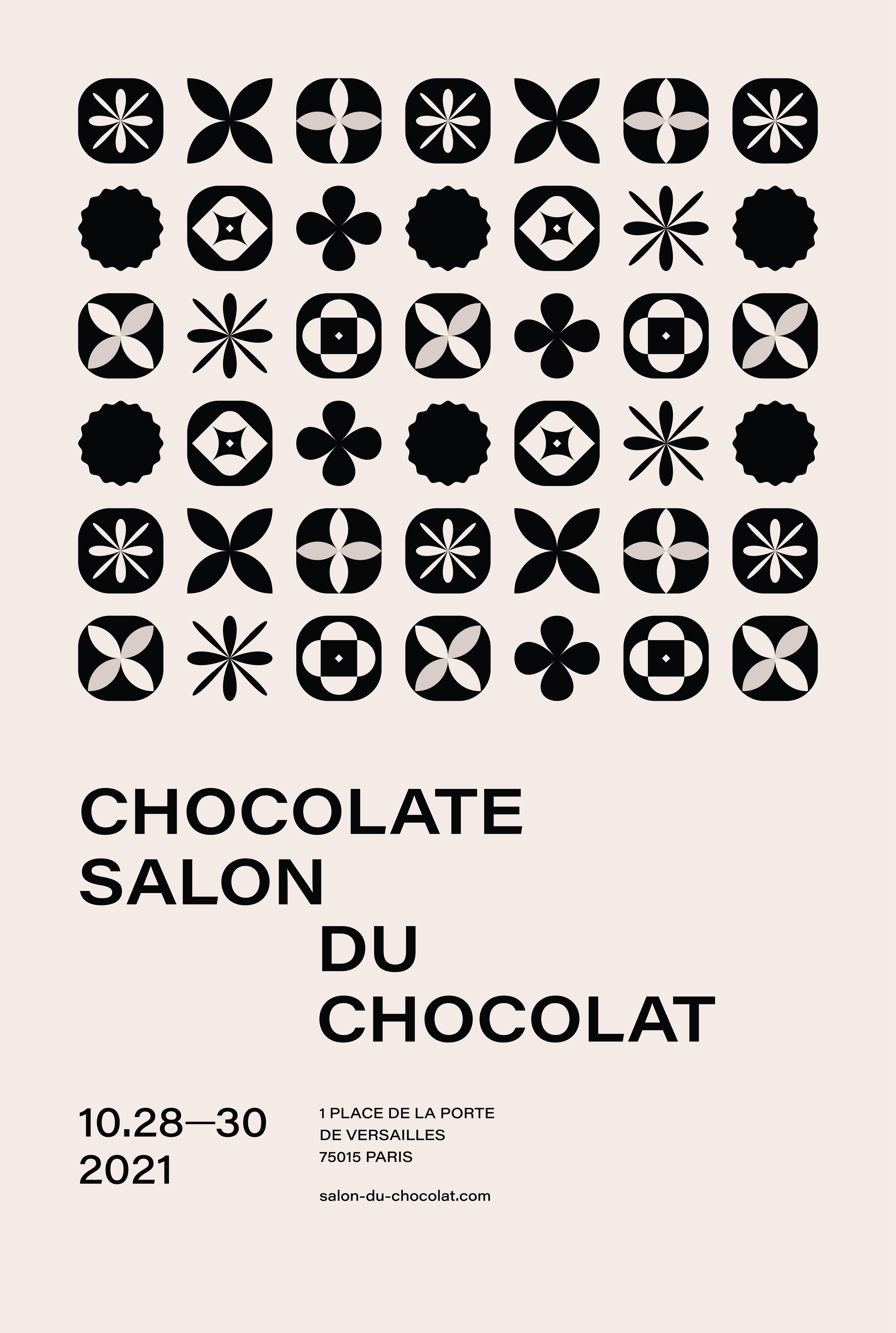
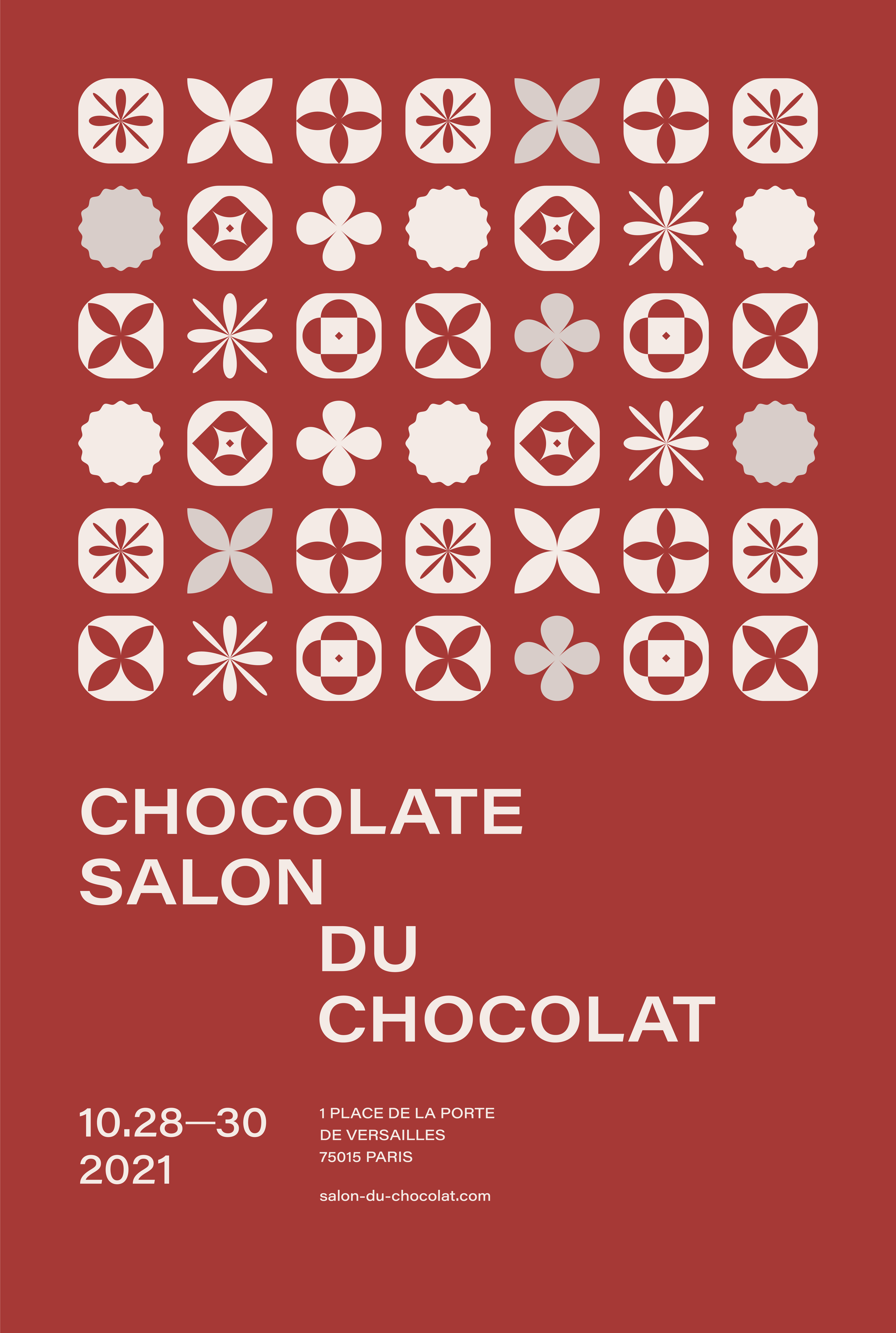
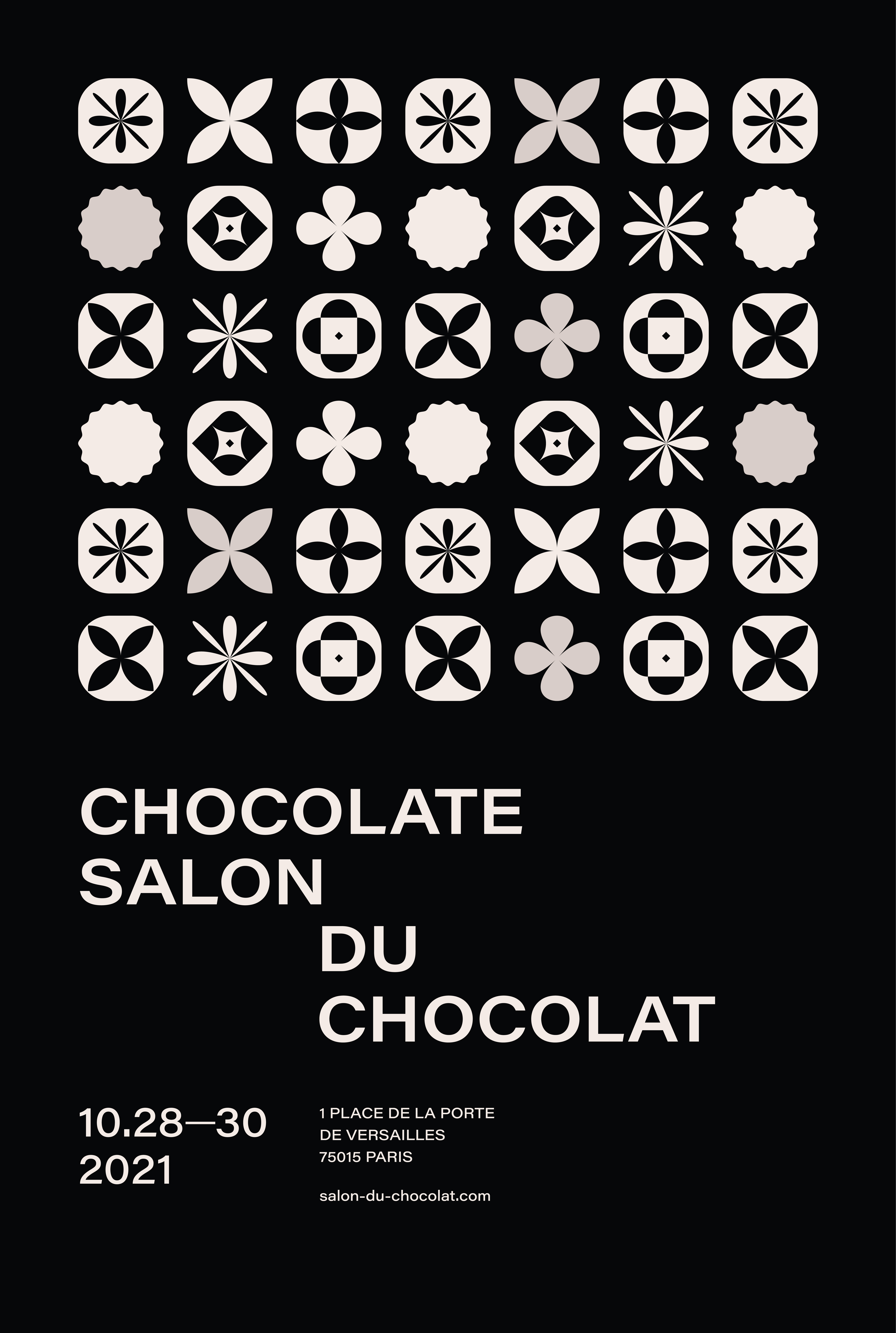
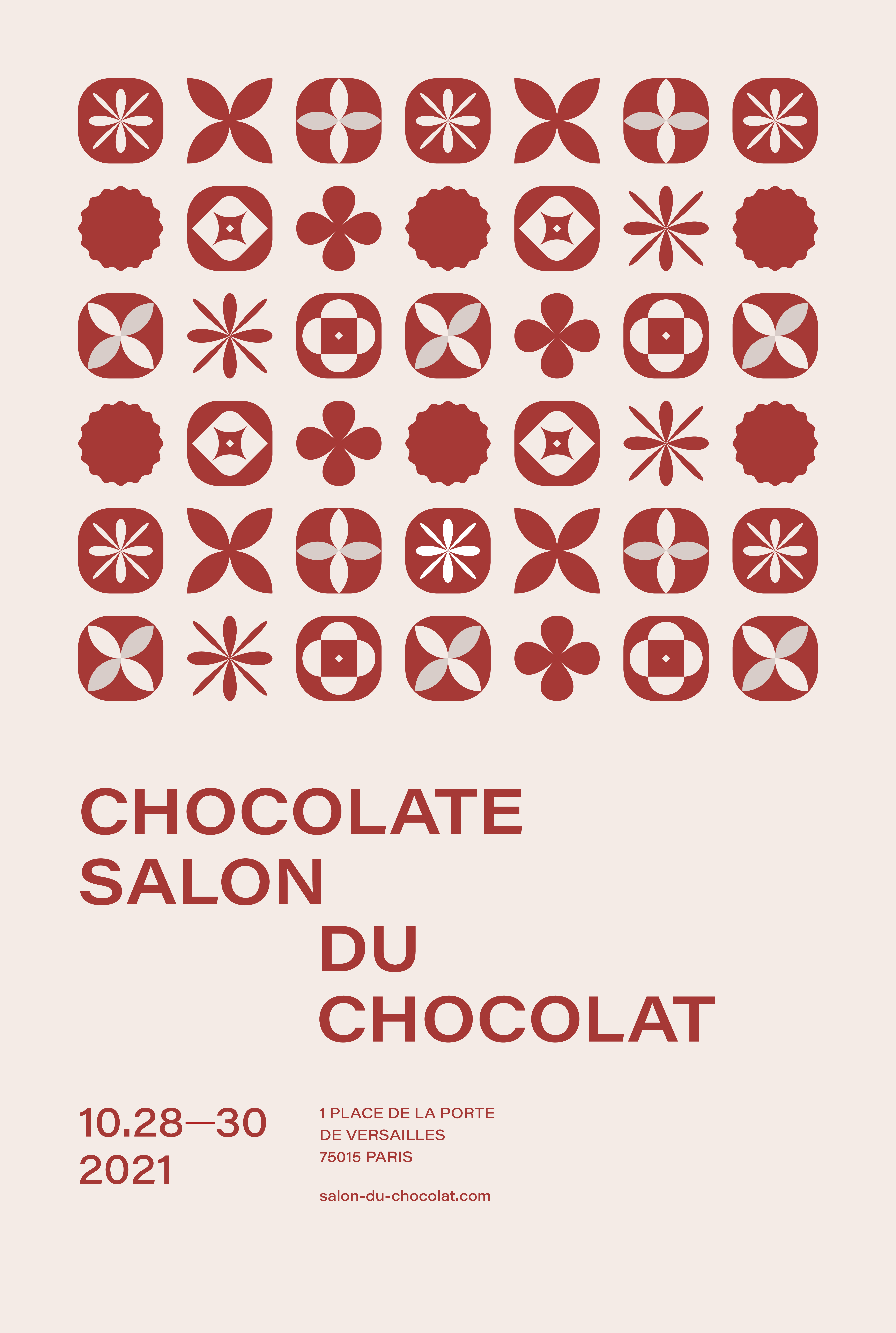


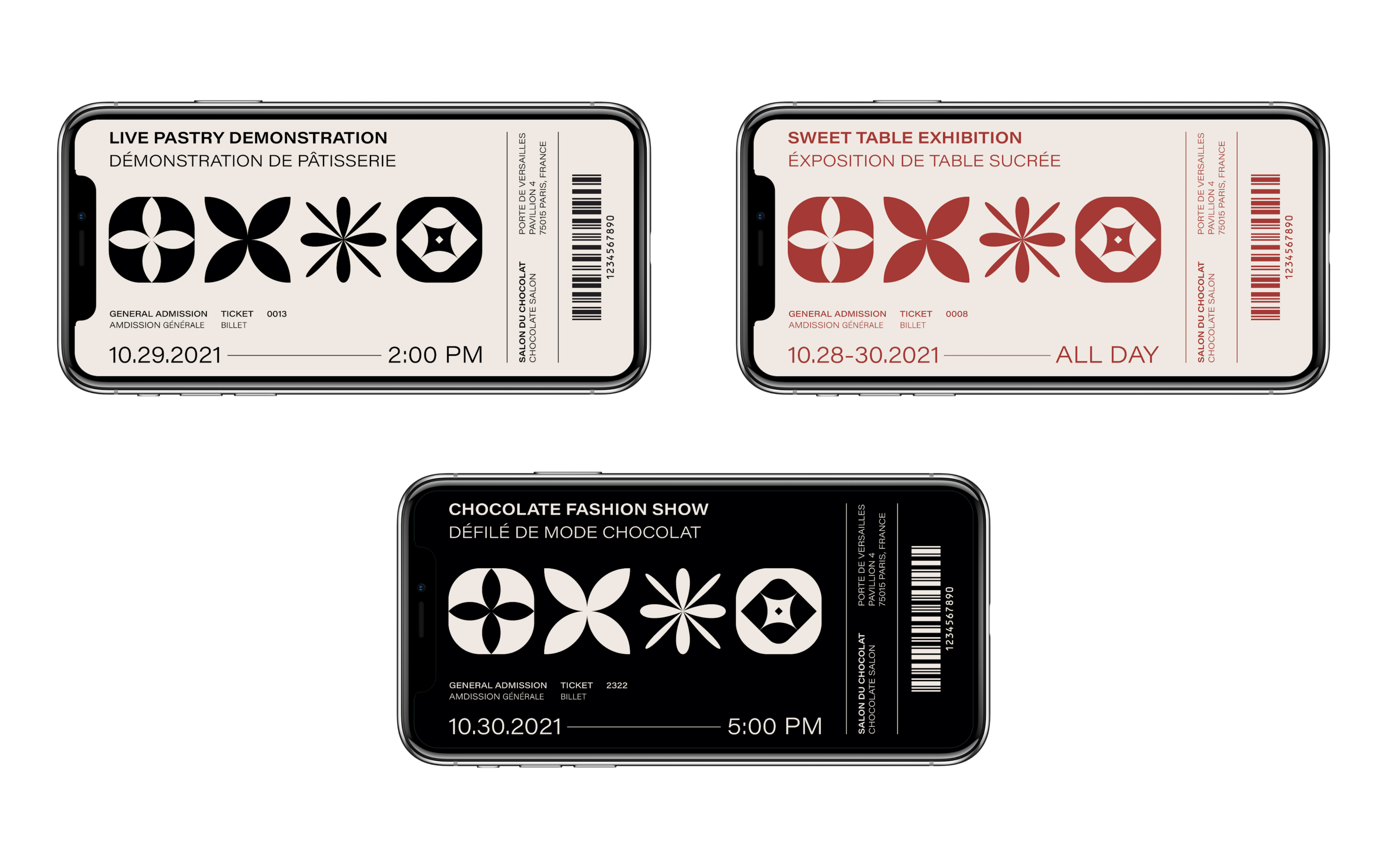
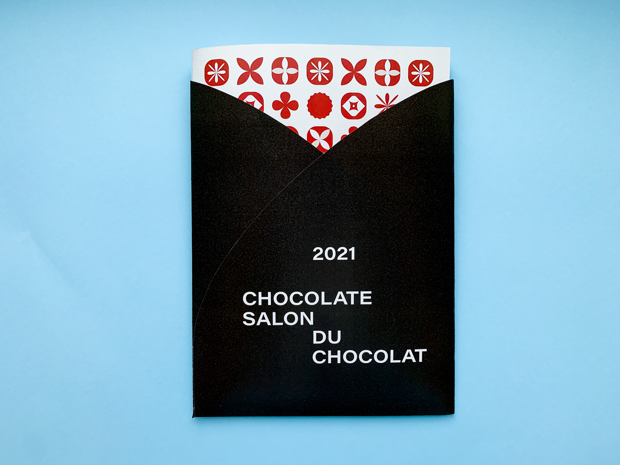
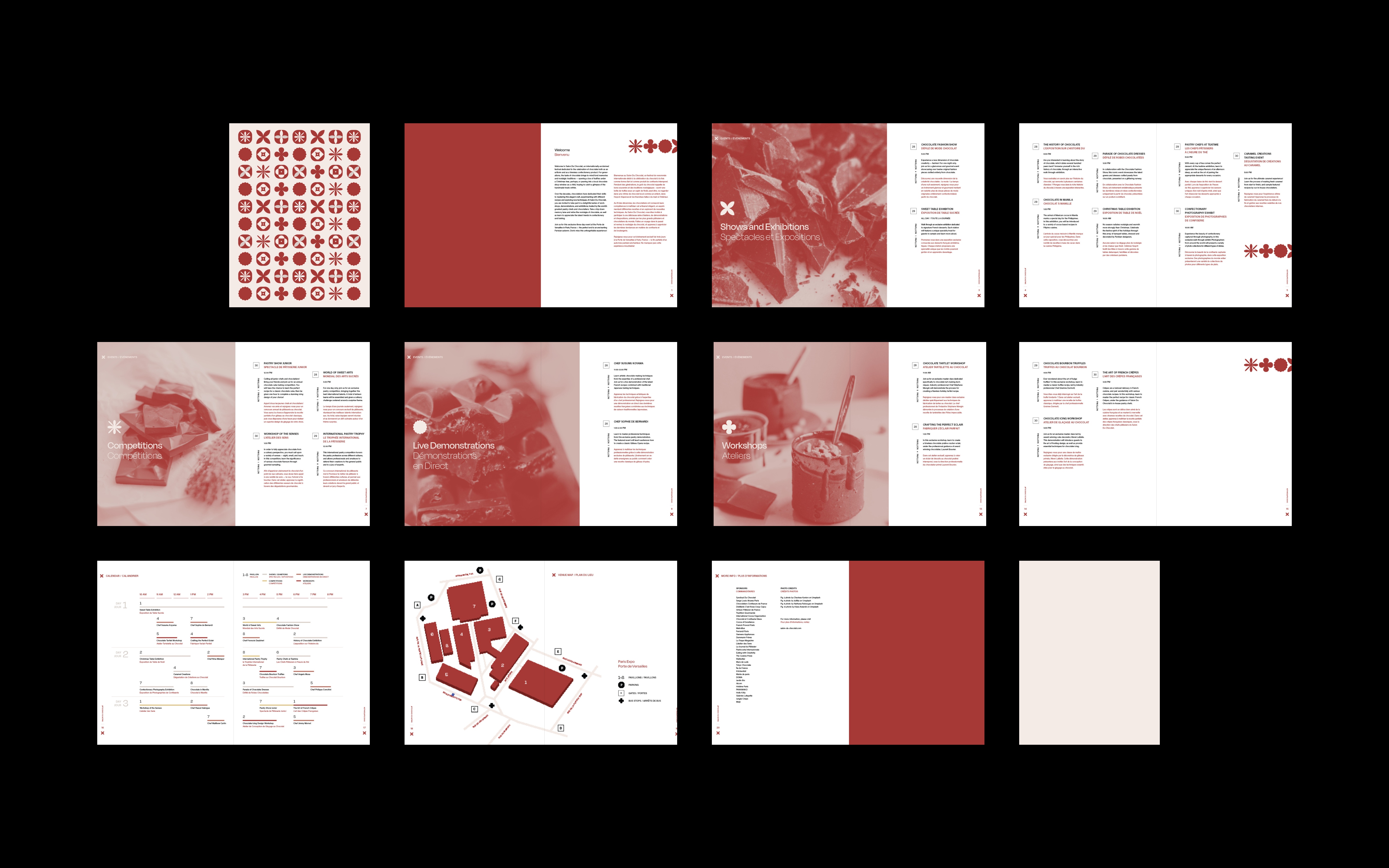
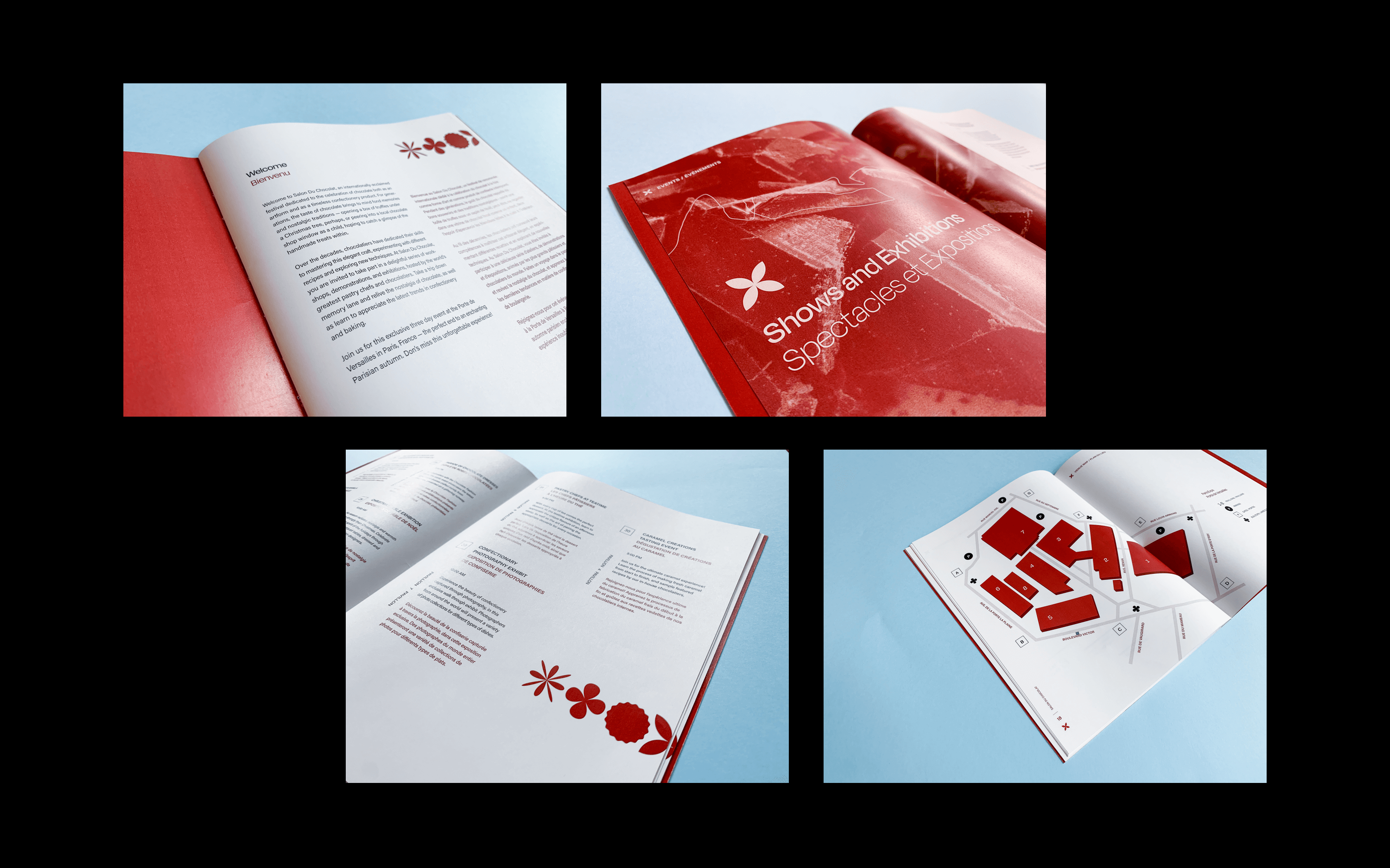
Following a symbolic approach, I created a new brand identity that more accurately reflects the essence of Salon Du Chocolat. I designed a collection of geometric motifs that pay homage to the detail and intricacy of confectionery, emphasizing that it is as much an artform as it is a craft. Acting as the primary brand element, these motifs were carried throughout a series of deliverables, which include: a line of posters, e-tickets, and an event booklet. The new visual system ultimately communicates the spirit of the festival in a simple yet effective way, capturing the artistic flair of a beloved craft.
Following a symbolic approach, I created a new brand identity that more accurately reflects the essence of Salon Du Chocolat. I designed a collection of geometric motifs that pay homage to the detail and intricacy of confectionery, emphasizing that it is as much an artform as it is a craft. Acting as the primary brand element, these motifs were carried throughout a series of deliverables, which include: a line of posters, e-tickets, and an event booklet. The new visual system ultimately communicates the spirit of the festival in a simple yet effective way, capturing the artistic flair of a beloved craft.
Following a symbolic approach, I created a new brand identity that more accurately reflects the essence of Salon Du Chocolat. I designed a collection of geometric motifs that pay homage to the detail and intricacy of confectionery, emphasizing that it is as much an artform as it is a craft. Acting as the primary brand element, these motifs were carried throughout a series of deliverables, which include: a line of posters, e-tickets, and an event booklet. The new visual system ultimately communicates the spirit of the festival in a simple yet effective way, capturing the artistic flair of a beloved craft.
