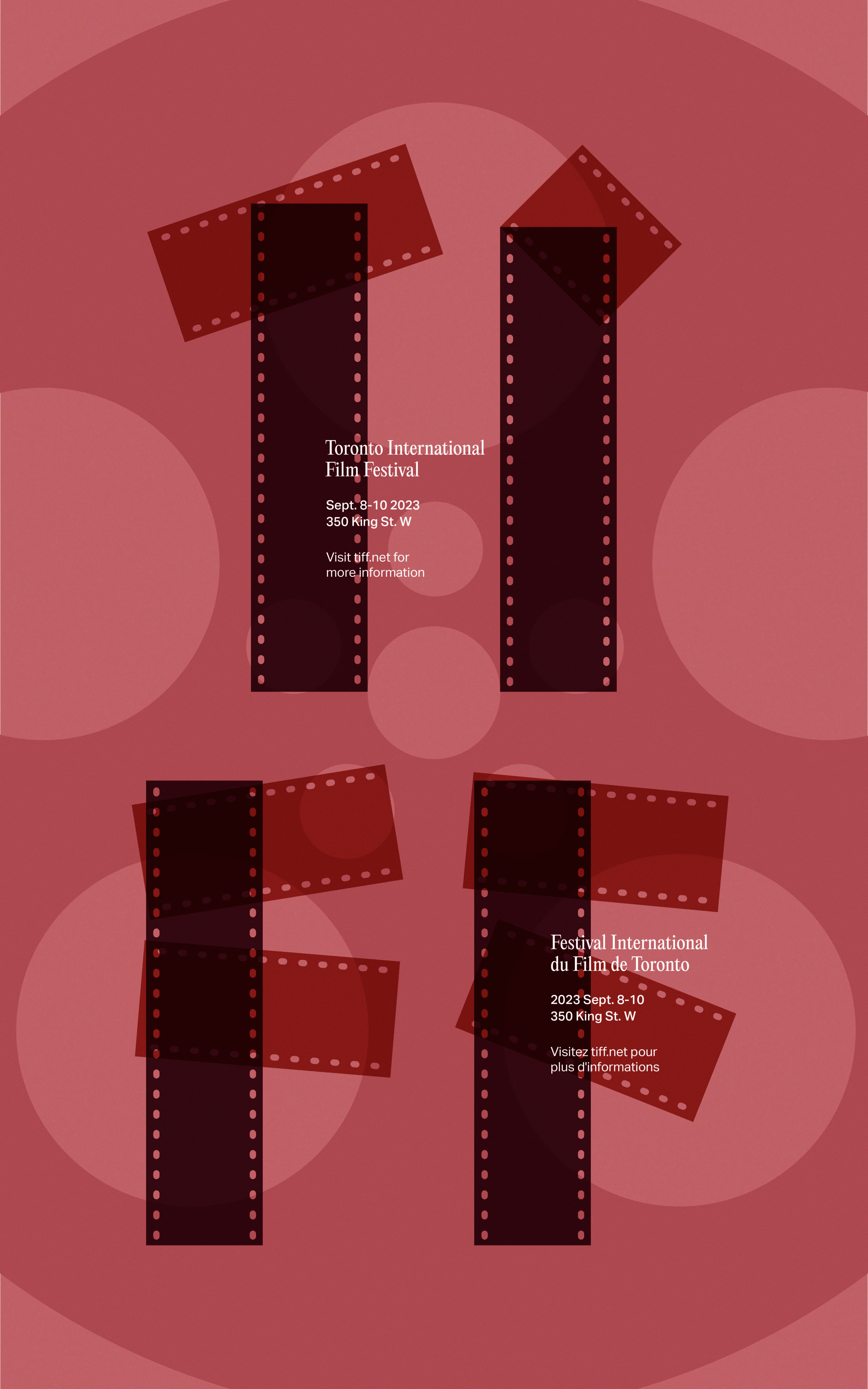


The Toronto International Film Festival takes place yearly in September, usually after labour day, which creates opportunities for filmmakers and the general public to attend as it’s a transitional period between the on and off seasons for film and work. The purpose of the festival is to transform the way people see the world through film. The poster is classy yet modern, combining the traditional and analog appearance of film in a digital poster. It follows a symbolic and representational approach by using film strips to mimic a hand-placed, organic look. Quiet typography is used to inform the audience about the details of the festival while also letting the main element speak for itself.
The Toronto International Film Festival takes place yearly in September, usually after labour day, which creates opportunities for filmmakers and the general public to attend as it’s a transitional period between the on and off seasons for film and work. The purpose of the festival is to transform the way people see the world through film. The poster is classy yet modern, combining the traditional and analog appearance of film in a digital poster. It follows a symbolic and representational approach by using film strips to mimic a hand-placed, organic look. Quiet typography is used to inform the audience about the details of the festival while also letting the main element speak for itself.
The Toronto International Film Festival takes place yearly in September, usually after labour day, which creates opportunities for filmmakers and the general public to attend as it’s a transitional period between the on and off seasons for film and work. The purpose of the festival is to transform the way people see the world through film. The poster is classy yet modern, combining the traditional and analog appearance of film in a digital poster. It follows a symbolic and representational approach by using film strips to mimic a hand-placed, organic look. Quiet typography is used to inform the audience about the details of the festival while also letting the main element speak for itself.