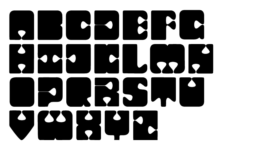


The reasoning behind this typeface was to create something funky yet consistent. The bold typeface with the contrast of small eyes and counters also helped create the aesthetic appearance of a puzzle. This idea is how I decided to use the letters within a composition: taking up the entirety of the page, fitting and piecing together like a puzzle.
The reasoning behind this typeface was to create something funky yet consistent. The bold typeface with the contrast of small eyes and counters also helped create the aesthetic appearance of a puzzle. This idea is how I decided to use the letters within a composition: taking up the entirety of the page, fitting and piecing together like a puzzle.
The reasoning behind this typeface was to create something funky yet consistent. The bold typeface with the contrast of small eyes and counters also helped create the aesthetic appearance of a puzzle. This idea is how I decided to use the letters within a composition: taking up the entirety of the page, fitting and piecing together like a puzzle.
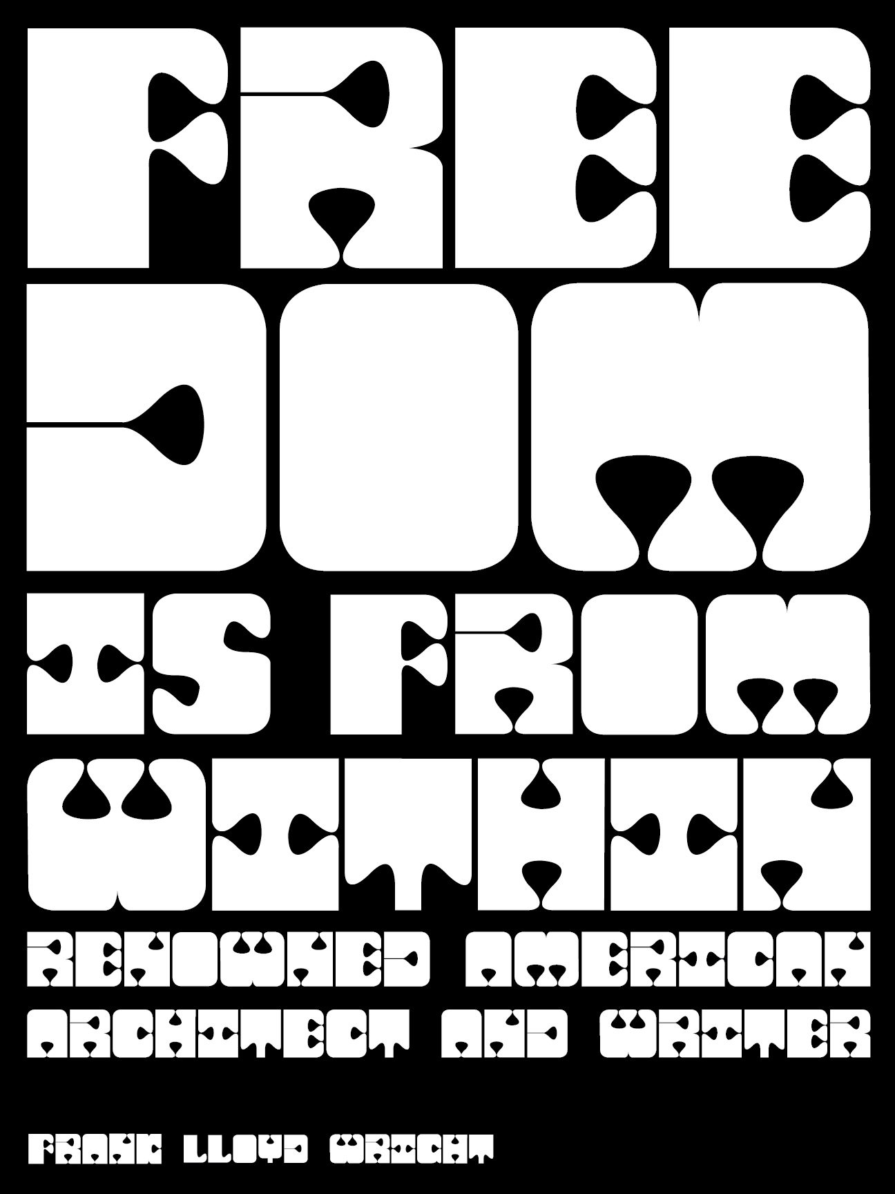


This poster uses a quote from Frank Lloyd Wright, an interesting pairing to the typeface.
This poster uses a quote from Frank Lloyd Wright, an interesting pairing to the typeface.
This poster uses a quote from Frank Lloyd Wright, an interesting pairing to the typeface.