Jennifer Louise Huynh
Pokémon vs. 2021 Card Prices
Branding
•
Design Research
•
Info Design
•
Motion
•
Packaging
•
•
Product
•
Info Design
Jennifer Louise Huynh
Regent Park Community Centre
Branding
•
Design Research
•
Info Design
•
Motion
•
Packaging
•
•
Product
•
Product
Jennifer Louise Huynh
Crossed Paws
Branding
•
Design Research
•
Info Design
•
Motion
•
Packaging
•
•
Product
•
Product
Claudia Ladeira
Beauty On Your Terms
Branding
•
Design Research
•
Info Design
•
Motion
•
Packaging
•
•
Product
•
Branding
Claudia Ladeira
Treasure Trove
Branding
•
Design Research
•
Info Design
•
Motion
•
Packaging
•
•
Product
•
Branding
Ingrid Wong
at the heart of your neighbourhood
Branding
•
Design Research
•
Info Design
•
Motion
•
Packaging
•
•
Product
•
Branding
Jasmine Wong
Lowkey Differences, Highkey Important
Branding
•
Design Research
•
Info Design
•
Motion
•
Packaging
•
•
Product
•
Print
Serena Wong
Lightning In A Bottle
Branding
•
Design Research
•
Info Design
•
Motion
•
Packaging
•
•
Product
•
Print
Jasmine Wong
The Honest and Transparent First-Gen Experience
Branding
•
Design Research
•
Info Design
•
Motion
•
Packaging
•
•
Product
•
Print
Serena Wong
Bilingual Classroom Signs
Branding
•
Design Research
•
Info Design
•
Motion
•
Packaging
•
•
Product
•
Print
Brienna Hogben
Pause: Self-care for the Senses
Branding
•
Design Research
•
Info Design
•
Motion
•
Packaging
•
•
Product
•
Branding
Adrianna Kirovski
Book Design Features
Branding
•
Design Research
•
Info Design
•
Motion
•
Packaging
•
•
Product
•
Print
Adrianna Kirovski
Shoot Magazine
Branding
•
Design Research
•
Info Design
•
Motion
•
Packaging
•
•
Product
•
Print
Kyle Tillado
Little Mansions: José Rizal as a Novelist
Branding
•
Design Research
•
Info Design
•
Motion
•
Packaging
•
•
Product
•
Print
Kyle Tillado
Lollapalooza
Branding
•
Design Research
•
Info Design
•
Motion
•
Packaging
•
•
Product
•
Branding
Azile Nuñez
Design Lab Identity
Branding
•
Design Research
•
Info Design
•
Motion
•
Packaging
•
•
Product
•
Branding
Abigail Wiley
Bumble x Pur Gum
Branding
•
Design Research
•
Info Design
•
Motion
•
Packaging
•
•
Product
•
Packaging
Azile Nuñez
Panagbenga Festival
Branding
•
Design Research
•
Info Design
•
Motion
•
Packaging
•
•
Product
•
Branding
Azile Nuñez
Pre colonial Philippines, Animism
Branding
•
Design Research
•
Info Design
•
Motion
•
Packaging
•
•
Product
•
Product
Kyle Tillado
Batang Baybayin
Branding
•
Design Research
•
Info Design
•
Motion
•
Packaging
•
•
Product
•
Packaging
Abigail Wiley
Let the DJ do the Mixing
Branding
•
Design Research
•
Info Design
•
Motion
•
Packaging
•
•
Product
•
Packaging
Abigail Wiley
The Toronto Food and Drink Guide for Art Lovers
Branding
•
Design Research
•
Info Design
•
Motion
•
Packaging
•
•
Product
•
Print
Serena Wong
Toronto International Film Festival
Branding
•
Design Research
•
Info Design
•
Motion
•
Packaging
•
•
Product
•
Branding
Brienna Hogben
InterStella: An Illustrated Guide to Astrology
Branding
•
Design Research
•
Info Design
•
Motion
•
Packaging
•
•
Product
•
Print
Claudia Ladeira
Bom Dia Portugal Good Morning Portugal
Branding
•
Design Research
•
Info Design
•
Motion
•
Packaging
•
•
Product
•
Print
Iris Blanco
Autism Spectrum Disorder: A Latina Experience
Branding
•
Design Research
•
Info Design
•
Motion
•
Packaging
•
•
Product
•
Print
Iris Blanco
Touching Spirit Bear Cover
Branding
•
Design Research
•
Info Design
•
Motion
•
Packaging
•
•
Product
•
Print
Iris Blanco
Cartoon Violence
Branding
•
Design Research
•
Info Design
•
Motion
•
Packaging
•
•
Product
•
Info Design
Brienna Hogben
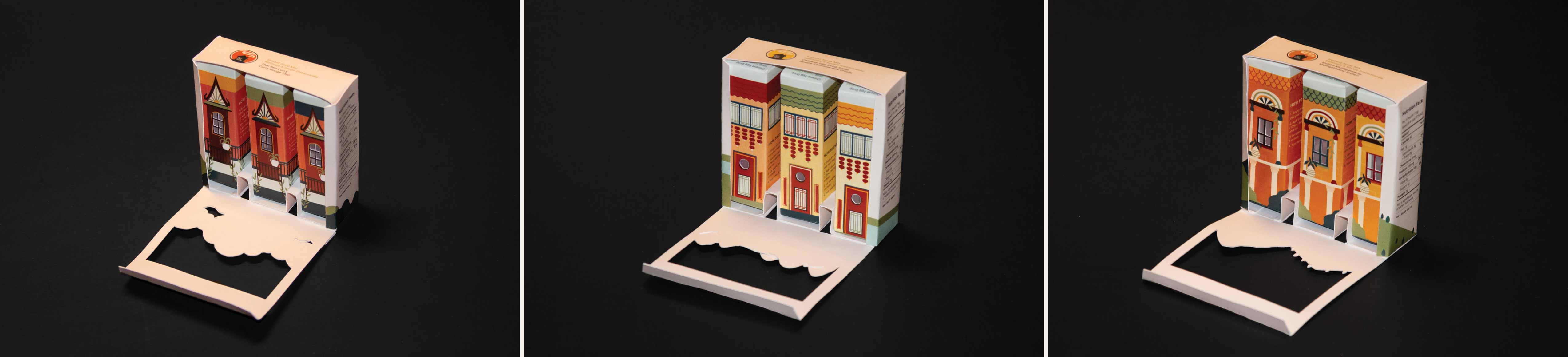
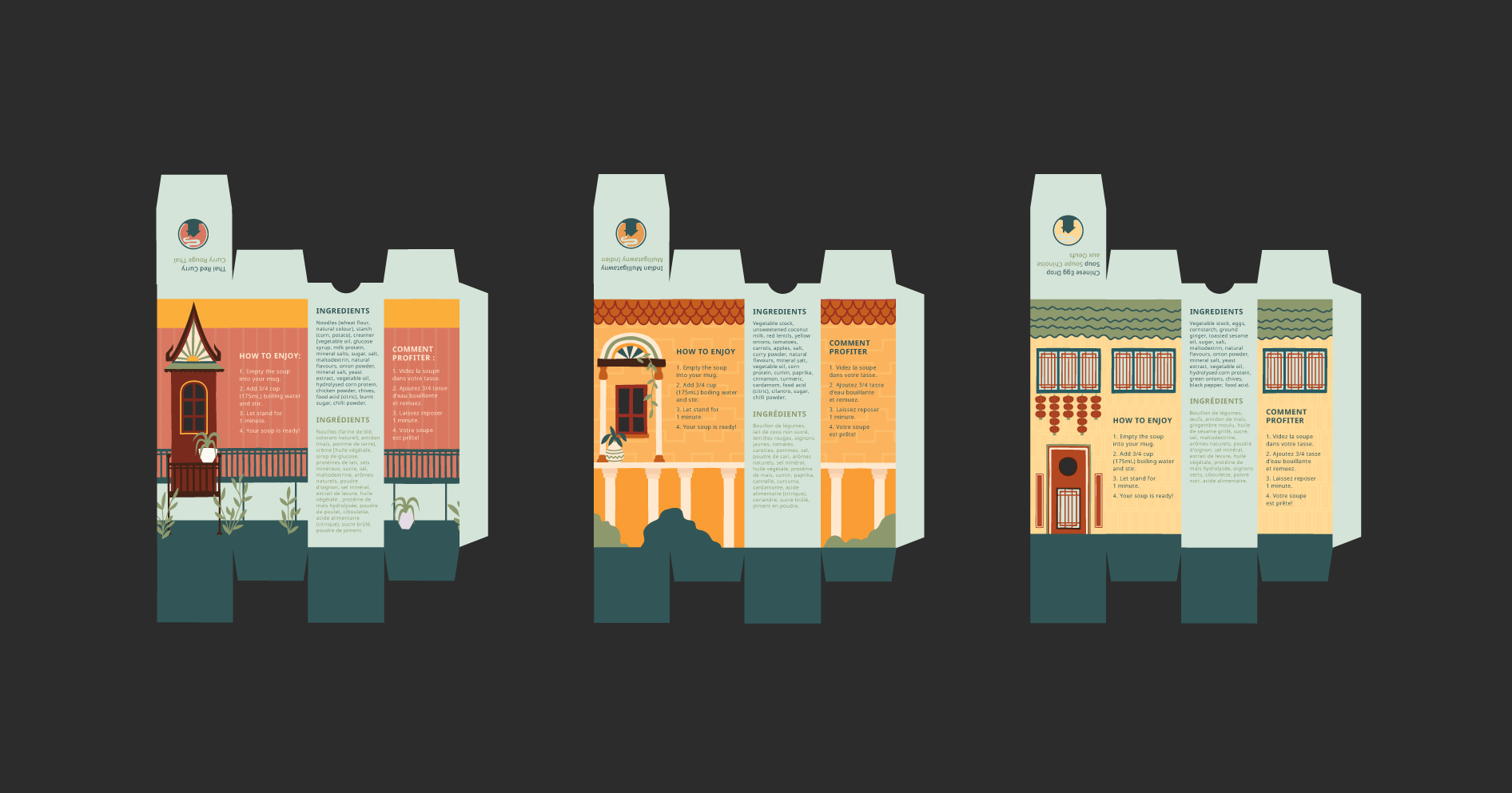
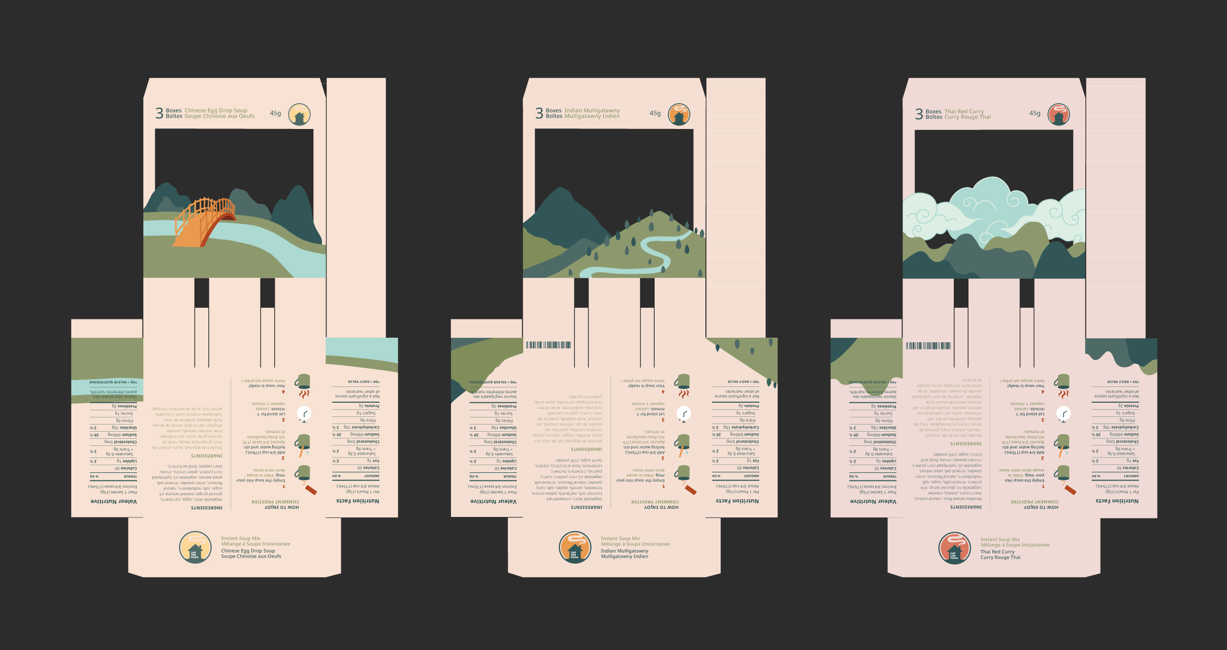
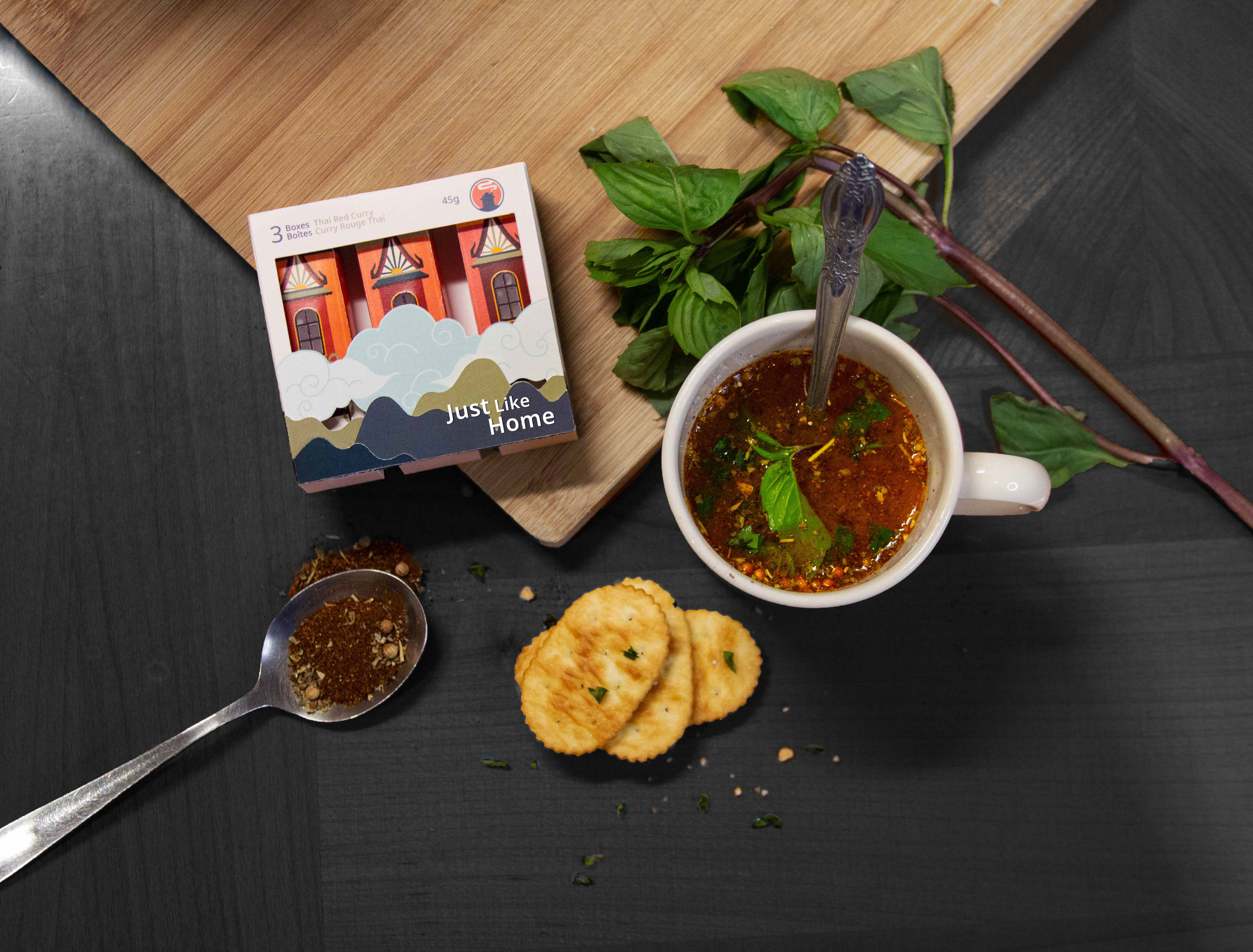
Mustang Stampede Packaging and Branding
Branding
•
Design Research
•
Info Design
•
Motion
•
Packaging
•
•
Product
•
Packaging
Claudia Ladeira
Yeezy Release
Branding
•
Design Research
•
Info Design
•
Motion
•
Packaging
•
•
Product
•
Info Design
Brienna Hogben
365 Days of Music
Branding
•
Design Research
•
Info Design
•
Motion
•
Packaging
•
•
Product
•
Info Design
Claudia Ladeira
VELD Music Festival
Branding
•
Design Research
•
Info Design
•
Motion
•
Packaging
•
•
Product
•
Branding
Kristen Chan
music&psychology
Branding
•
Design Research
•
Info Design
•
Motion
•
Packaging
•
•
Product
•
Motion
Kristen Chan
Kō-en Washi Tape Package Design
Branding
•
Design Research
•
Info Design
•
Motion
•
Packaging
•
•
Product
•
Packaging
Iris Blanco
Smoke Bomb Pre-rolls
Branding
•
Design Research
•
Info Design
•
Motion
•
Packaging
•
•
Product
•
Packaging
Thank you! Your submission has been received!
Oops! Something went wrong while submitting the form.
Jennifer Louise Huynh
Pokémon vs. 2021 Card Prices
Branding
•
Design Research
•
Info Design
•
Motion
•
Packaging
•
•
Product
•
Info Design
Jennifer Louise Huynh
Regent Park Community Centre
Branding
•
Design Research
•
Info Design
•
Motion
•
Packaging
•
•
Product
•
Product
Jennifer Louise Huynh
Crossed Paws
Branding
•
Design Research
•
Info Design
•
Motion
•
Packaging
•
•
Product
•
Product
Claudia Ladeira
Beauty On Your Terms
Branding
•
Design Research
•
Info Design
•
Motion
•
Packaging
•
•
Product
•
Branding
Claudia Ladeira
Treasure Trove
Branding
•
Design Research
•
Info Design
•
Motion
•
Packaging
•
•
Product
•
Branding
Ingrid Wong
at the heart of your neighbourhood
Branding
•
Design Research
•
Info Design
•
Motion
•
Packaging
•
•
Product
•
Branding
Jasmine Wong
Lowkey Differences, Highkey Important
Branding
•
Design Research
•
Info Design
•
Motion
•
Packaging
•
•
Product
•
Print
Serena Wong
Lightning In A Bottle
Branding
•
Design Research
•
Info Design
•
Motion
•
Packaging
•
•
Product
•
Print
Jasmine Wong
The Honest and Transparent First-Gen Experience
Branding
•
Design Research
•
Info Design
•
Motion
•
Packaging
•
•
Product
•
Print
Serena Wong
Bilingual Classroom Signs
Branding
•
Design Research
•
Info Design
•
Motion
•
Packaging
•
•
Product
•
Print
Brienna Hogben
Pause: Self-care for the Senses
Branding
•
Design Research
•
Info Design
•
Motion
•
Packaging
•
•
Product
•
Branding
Adrianna Kirovski
Book Design Features
Branding
•
Design Research
•
Info Design
•
Motion
•
Packaging
•
•
Product
•
Print
Adrianna Kirovski
Shoot Magazine
Branding
•
Design Research
•
Info Design
•
Motion
•
Packaging
•
•
Product
•
Print
Kyle Tillado
Little Mansions: José Rizal as a Novelist
Branding
•
Design Research
•
Info Design
•
Motion
•
Packaging
•
•
Product
•
Print
Kyle Tillado
Lollapalooza
Branding
•
Design Research
•
Info Design
•
Motion
•
Packaging
•
•
Product
•
Branding
Azile Nuñez
Design Lab Identity
Branding
•
Design Research
•
Info Design
•
Motion
•
Packaging
•
•
Product
•
Branding
Abigail Wiley
Bumble x Pur Gum
Branding
•
Design Research
•
Info Design
•
Motion
•
Packaging
•
•
Product
•
Packaging
Azile Nuñez
Panagbenga Festival
Branding
•
Design Research
•
Info Design
•
Motion
•
Packaging
•
•
Product
•
Branding
Azile Nuñez
Pre colonial Philippines, Animism
Branding
•
Design Research
•
Info Design
•
Motion
•
Packaging
•
•
Product
•
Product
Kyle Tillado
Batang Baybayin
Branding
•
Design Research
•
Info Design
•
Motion
•
Packaging
•
•
Product
•
Packaging
Abigail Wiley
Let the DJ do the Mixing
Branding
•
Design Research
•
Info Design
•
Motion
•
Packaging
•
•
Product
•
Packaging
Abigail Wiley
The Toronto Food and Drink Guide for Art Lovers
Branding
•
Design Research
•
Info Design
•
Motion
•
Packaging
•
•
Product
•
Print
Serena Wong
Toronto International Film Festival
Branding
•
Design Research
•
Info Design
•
Motion
•
Packaging
•
•
Product
•
Branding
Brienna Hogben
InterStella: An Illustrated Guide to Astrology
Branding
•
Design Research
•
Info Design
•
Motion
•
Packaging
•
•
Product
•
Print
Claudia Ladeira
Bom Dia Portugal Good Morning Portugal
Branding
•
Design Research
•
Info Design
•
Motion
•
Packaging
•
•
Product
•
Print
Iris Blanco
Autism Spectrum Disorder: A Latina Experience
Branding
•
Design Research
•
Info Design
•
Motion
•
Packaging
•
•
Product
•
Print
Iris Blanco
Touching Spirit Bear Cover
Branding
•
Design Research
•
Info Design
•
Motion
•
Packaging
•
•
Product
•
Print
Iris Blanco
Cartoon Violence
Branding
•
Design Research
•
Info Design
•
Motion
•
Packaging
•
•
Product
•
Info Design
Brienna Hogben
Mustang Stampede Packaging and Branding
Branding
•
Design Research
•
Info Design
•
Motion
•
Packaging
•
•
Product
•
Packaging
Claudia Ladeira
Yeezy Release
Branding
•
Design Research
•
Info Design
•
Motion
•
Packaging
•
•
Product
•
Info Design
Brienna Hogben
365 Days of Music
Branding
•
Design Research
•
Info Design
•
Motion
•
Packaging
•
•
Product
•
Info Design
Claudia Ladeira
VELD Music Festival
Branding
•
Design Research
•
Info Design
•
Motion
•
Packaging
•
•
Product
•
Branding
Kristen Chan
music&psychology
Branding
•
Design Research
•
Info Design
•
Motion
•
Packaging
•
•
Product
•
Motion
Kristen Chan
Kō-en Washi Tape Package Design
Branding
•
Design Research
•
Info Design
•
Motion
•
Packaging
•
•
Product
•
Packaging
Iris Blanco
Smoke Bomb Pre-rolls
Branding
•
Design Research
•
Info Design
•
Motion
•
Packaging
•
•
Product
•
Packaging